2  Binary Classification Metrics

This chapter evaluates forecast skill using binary classification metrics - the traditional approach where forecasts are judged as either “correct” or “incorrect” based on whether they cross a drought threshold.

Setup: Libraries, configuration, data loading, helper functions
library(tidyverse)
library(lubridate)
library(cumulus)
library(gghdx)
gghdx()

box::use(../../R/enacts)
box::use(../../R/seas5)

set.seed(42)

# =============================================================================
# CONFIGURATION
# =============================================================================

BASELINE_START <- 2000
BASELINE_END <- 2024

PRIMERA_MONTHS <- 5:8
POSTRERA_MONTHS <- 9:11

PRIMERA_ISSUED_MONTHS <- c(3, 4)
POSTRERA_ISSUED_MONTHS <- c(6, 7, 8)

N_BOOTSTRAP <- 1000

# =============================================================================
# LOAD DATA
# =============================================================================

df_insiv <- cumulus::blob_read(
  name = "ds-aa-lac-dry-corridor/data/processed/insivumeh_special/insivumeh_special_models_zonal_seasonal_chiquimula.parquet",
  container = "projects"
)
df_enacts <- enacts$load_enacts_seasonal("chiquimula")
df_seas5 <- seas5$load_seas5_seasonal()

aoi_pcode <- unique(df_insiv$aoi_pcode)
aoi_name <- unique(df_insiv$aoi_name)

# Load ERA5 from database
con <- pg_con()
df_era5_raw <- tbl(con, "era5") |>
  filter(pcode == aoi_pcode) |>
  collect() |>
  mutate(
    year = year(valid_date),
    month = month(valid_date),
    mean = mean * days_in_month(valid_date)  # Convert daily rate to monthly total (mm)
  )
DBI::dbDisconnect(con)

# Aggregate ERA5 to seasonal totals
aggregate_obs_seasonal <- function(df, window_name) {
 months <- if (window_name == "primera") PRIMERA_MONTHS else POSTRERA_MONTHS
  df |>
    filter(month %in% months) |>
    group_by(year) |>
    summarise(obs_mm = sum(value, na.rm = TRUE), .groups = "drop") |>
    mutate(window = window_name)
}

df_era5 <- bind_rows(
  aggregate_obs_seasonal(df_era5_raw |> rename(value = mean), "primera"),
  aggregate_obs_seasonal(df_era5_raw |> rename(value = mean), "postrera")
)

# Combine all forecasts
df_fcst_all <- bind_rows(df_insiv, df_seas5) |>
  filter(year >= BASELINE_START, year <= BASELINE_END)

# =============================================================================
# HELPER FUNCTIONS
# =============================================================================

calc_rp_threshold <- function(x, rp_target = 4, direction = -1) {
  x <- x[!is.na(x)]
  n <- length(x)
  if (n < 3) return(NA_real_)

  # Use proper ranking with tie handling
  # For direction = -1 (drought/low extreme): lowest values get rank 1 (highest RP)
  # For direction = 1 (flood/high extreme): highest values get rank 1 (highest RP)
  ranks <- rank(x * -direction, ties.method = "average")
  rp <- (n + 1) / ranks

  # Interpolate to find value at target RP
  approx(rp, x, xout = rp_target, rule = 2)$y
}

calc_f1 <- function(fcst_drought, obs_drought) {
  TP <- sum(fcst_drought & obs_drought, na.rm = TRUE)
  FP <- sum(fcst_drought & !obs_drought, na.rm = TRUE)
  FN <- sum(!fcst_drought & obs_drought, na.rm = TRUE)

  if (TP == 0) return(0)
  precision <- TP / (TP + FP)
  recall <- TP / (TP + FN)
  2 * precision * recall / (precision + recall)
}

3 Introduction

This analysis compares the skill of INSIVUMEH (regional) and SEAS5 (global) seasonal precipitation forecasts for detecting drought conditions in Chiquimula, Guatemala. We evaluate forecasts for two agricultural seasons:

  • Primera: May-August (MJJA)
  • Postrera: September-November (SON)

We use two comparison frameworks:

  1. Native: Each forecast validated against its typical observation source
    • SEAS5 vs ERA5
    • INSIVUMEH vs ENACTS
  2. ENACTS-only: All forecasts validated against the same observation source (ENACTS) for direct comparison

Drought is defined using a return period of 4 years (RP4), meaning approximately 6 drought years are expected over the 25-year baseline (2000-2024).

4 F1 Score Analysis

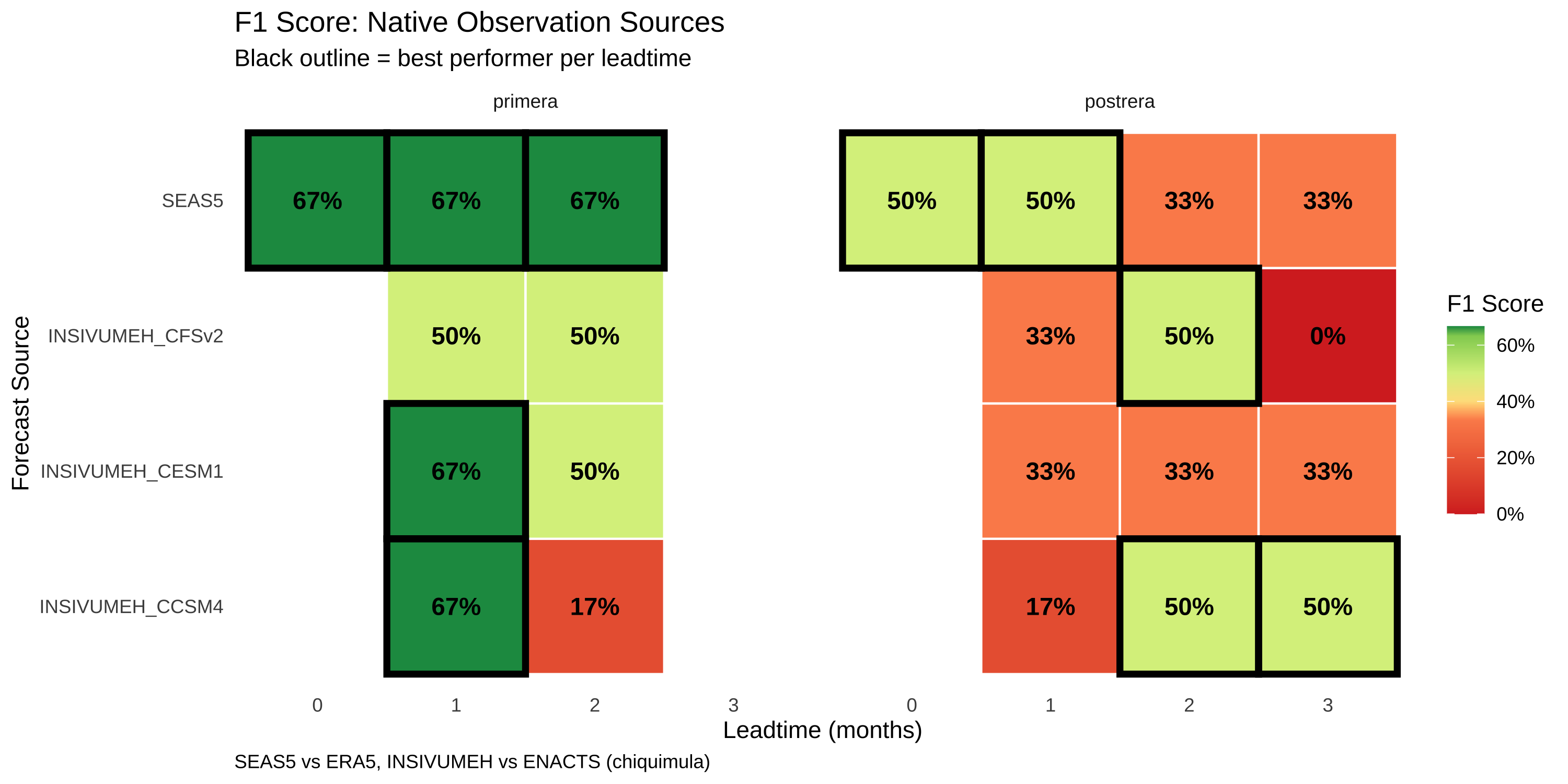
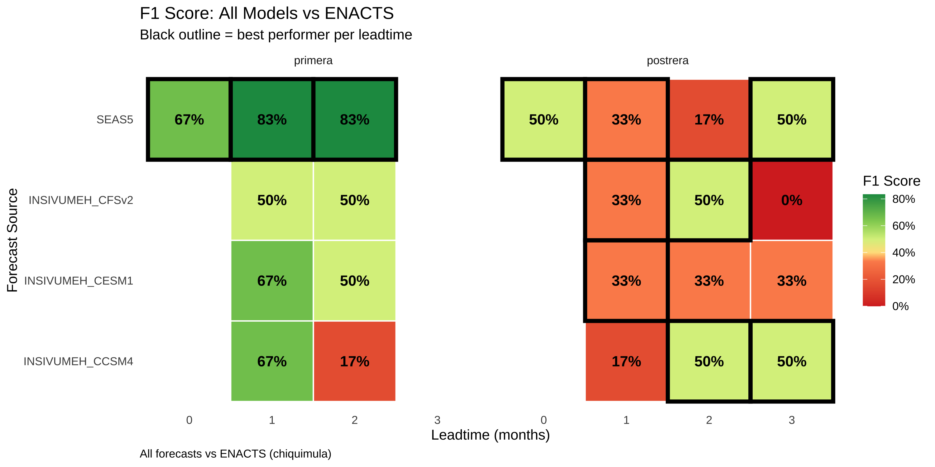
The F1 score balances precision (avoiding false alarms) and recall (detecting actual droughts). We calculate skill for each model-leadtime combination.

F1 heatmap visualization function
create_f1_heatmap <- function(df_skill, title, subtitle, caption) {
  df_plot <- df_skill |>
    filter(!is.na(f1)) |>
    mutate(window = factor(window, levels = c("primera", "postrera"))) |>
    group_by(window, leadtime) |>
    mutate(is_best = f1 == max(f1, na.rm = TRUE)) |>
    ungroup()

  f1_values <- df_plot$f1[!is.na(df_plot$f1)]
  quantile_breaks <- quantile(f1_values, probs = seq(0, 1, 0.2), na.rm = TRUE)

  ggplot(df_plot, aes(x = factor(leadtime), y = forecast_source)) +
    geom_tile(aes(fill = f1), color = "white", linewidth = 0.5) +
    geom_tile(
      data = df_plot |> filter(is_best),
      aes(x = factor(leadtime), y = forecast_source),
      fill = NA, color = "black", linewidth = 1.5
    ) +
    geom_text(aes(label = sprintf("%.0f%%", f1 * 100)), size = 4, fontface = "bold", color = "black") +
    facet_wrap(~window) +
    scale_fill_gradientn(
      colors = c("#D73027", "#FC8D59", "#FEE08B", "#D9EF8B", "#91CF60", "#1A9850"),
      values = scales::rescale(quantile_breaks),
      limits = range(f1_values),
      labels = scales::percent,
      na.value = "grey90"
    ) +
    labs(
      title = title,
      subtitle = subtitle,
      x = "Leadtime (months)",
      y = "Forecast Source",
      fill = "F1 Score",
      caption = caption
    ) +
    theme_minimal() +
    theme(
      legend.position = "right",
      panel.grid = element_blank(),
      plot.caption = element_text(hjust = 0)
    )
}

4.1 Native Comparison

SEAS5 validated against ERA5; INSIVUMEH models validated against ENACTS.

Code
create_f1_heatmap(
  df_skill_native,
  title = "F1 Score: Native Observation Sources",
  subtitle = "Black outline = best performer per leadtime",
  caption = paste0("SEAS5 vs ERA5, INSIVUMEH vs ENACTS (", aoi_name, ")")
)

4.2 ENACTS-Only Comparison

All models validated against ENACTS for direct comparison.

Code
create_f1_heatmap(
  df_skill_enacts,
  title = "F1 Score: All Models vs ENACTS",
  subtitle = "Black outline = best performer per leadtime",
  caption = paste0("All forecasts vs ENACTS (", aoi_name, ")")
)

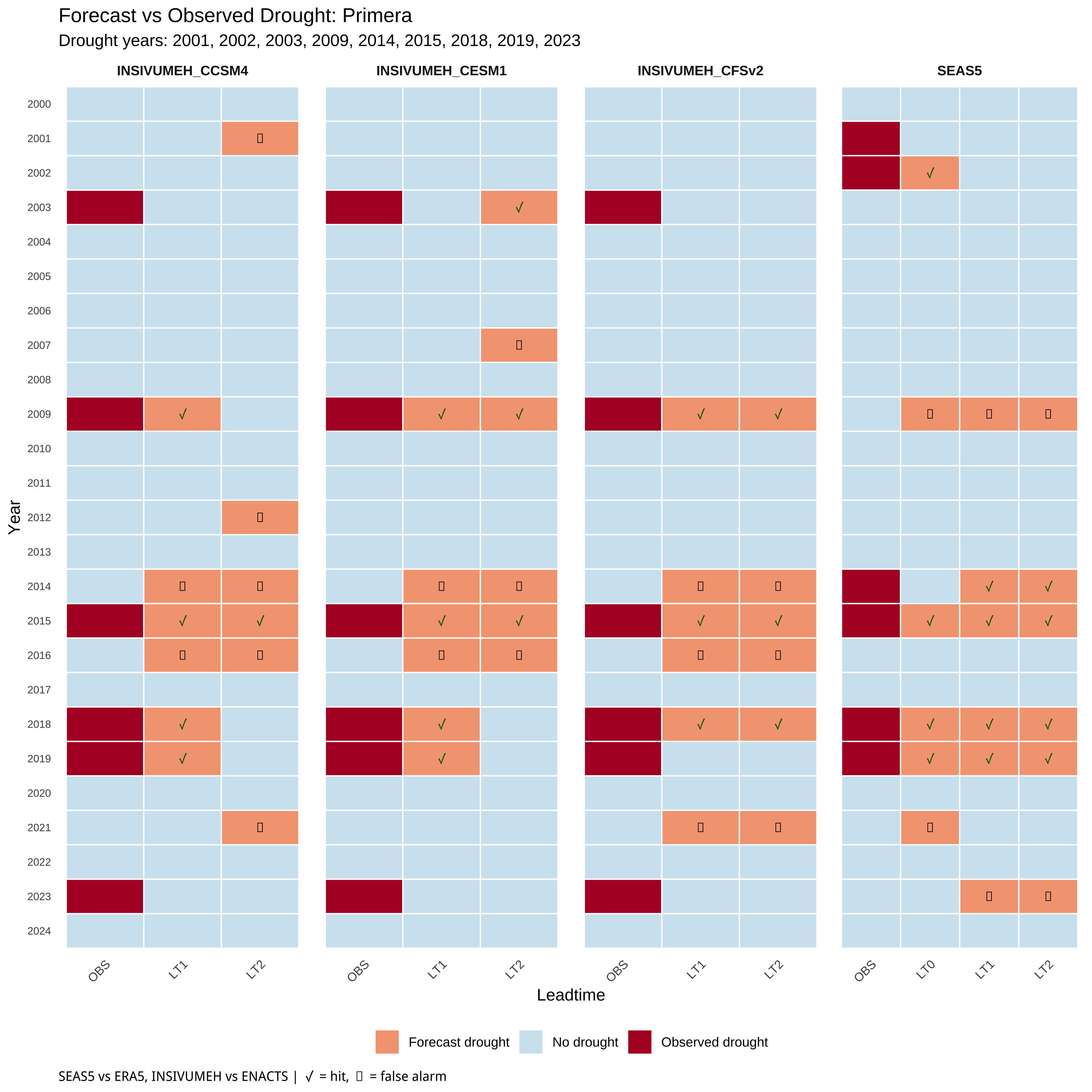
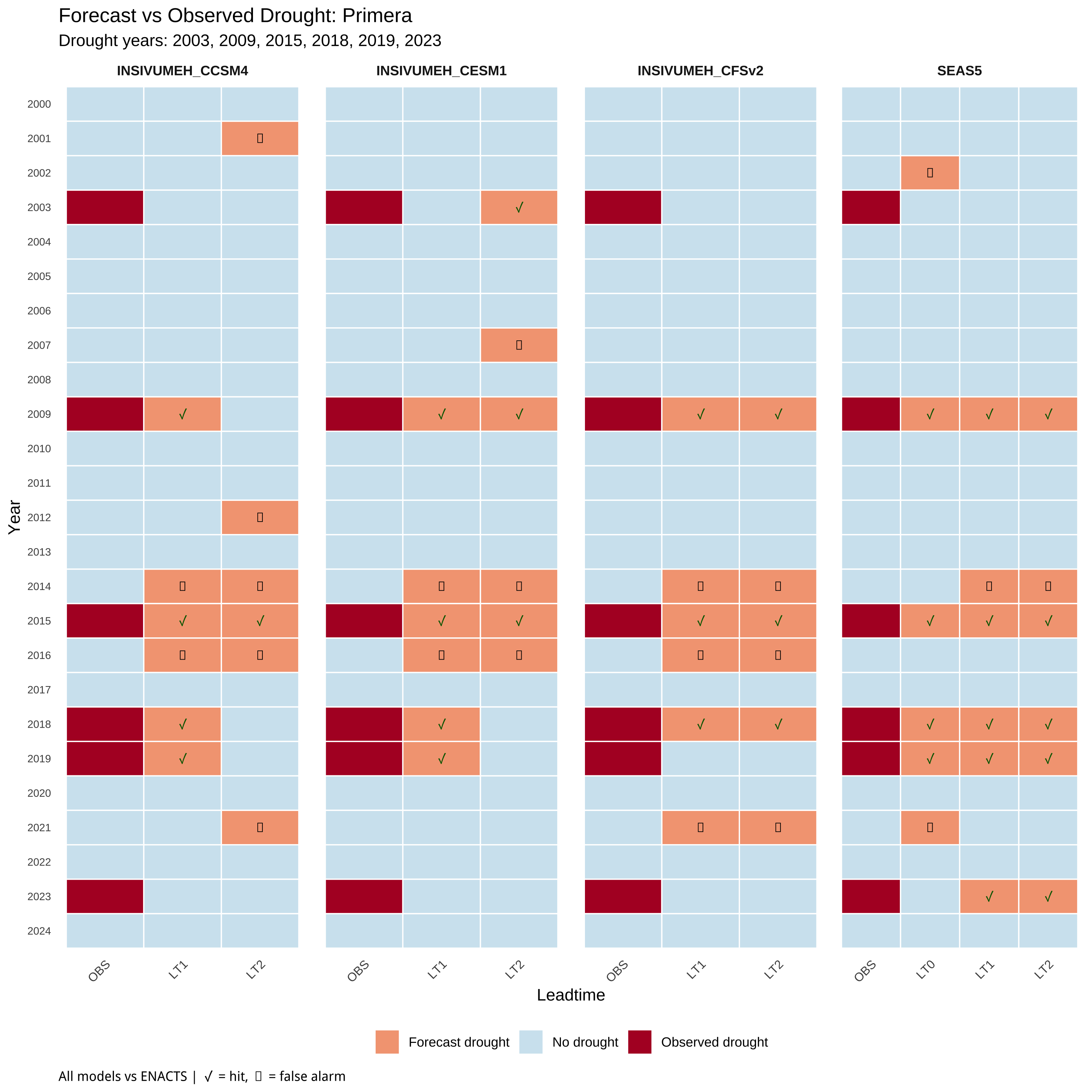
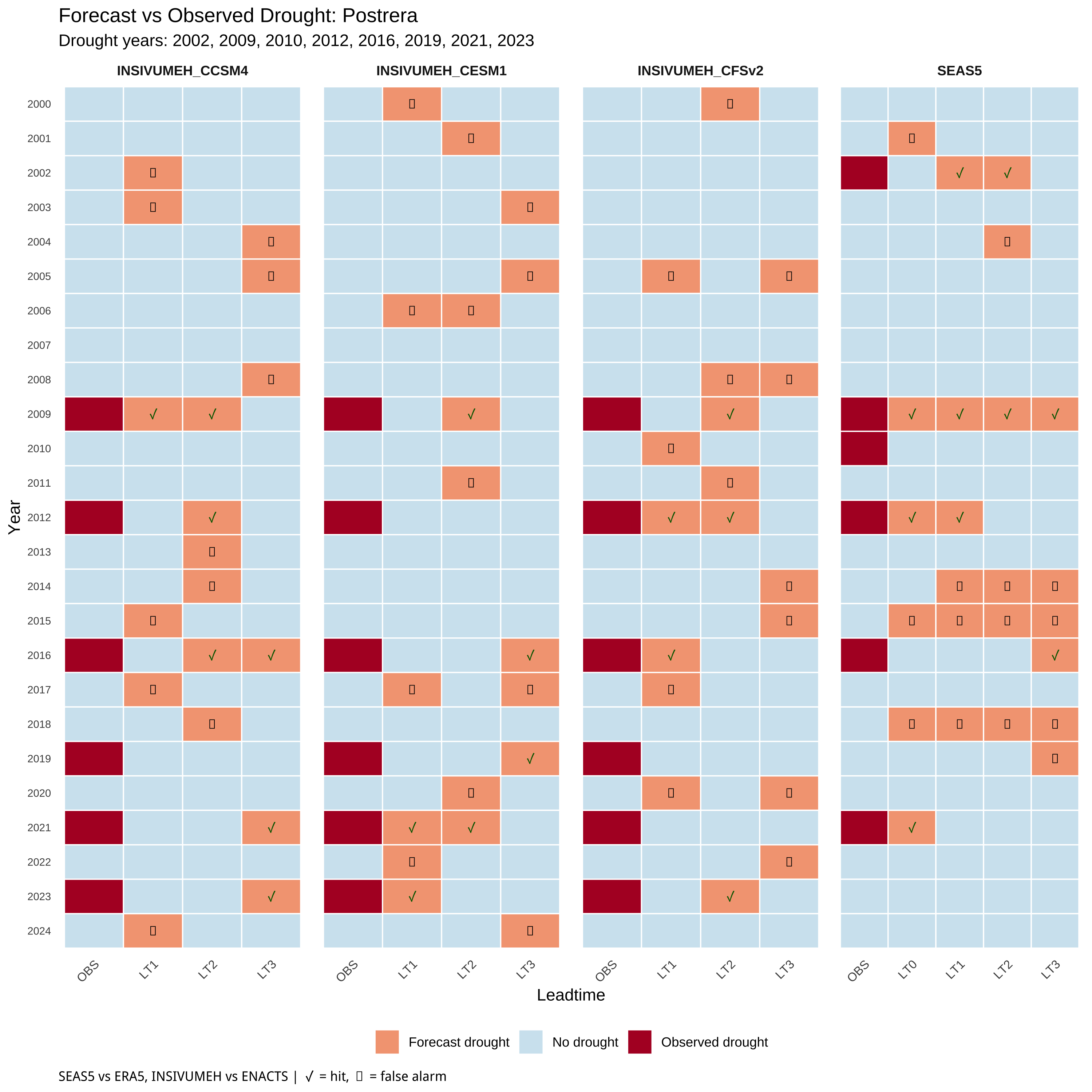
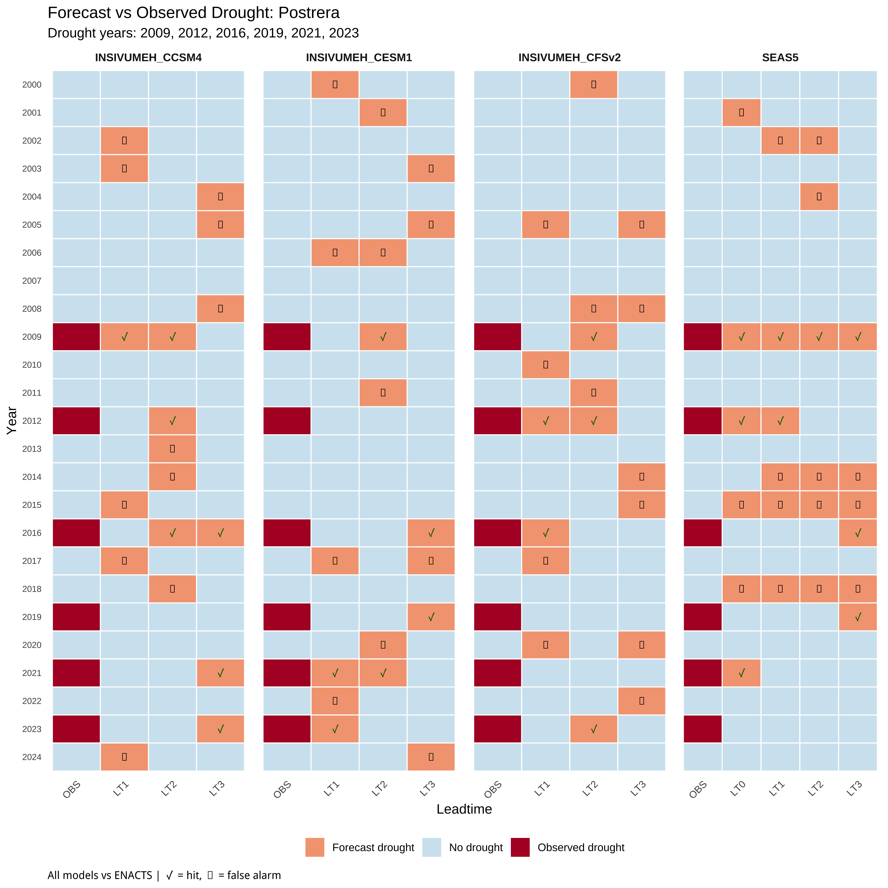
5 Year × Leadtime Classification

This section shows how each forecast performed in each individual year, revealing patterns in when forecasts succeed or fail.

Build year × leadtime classification data
build_yearlt_data <- function(df_fcst, df_obs, include_lt0 = FALSE) {

  baseline_years <- BASELINE_START:BASELINE_END

  # Observation thresholds
  obs_thresholds <- df_obs |>
    filter(year %in% baseline_years) |>
    group_by(window) |>
    summarise(rp4_obs = calc_rp_threshold(obs_mm, 4, -1), .groups = "drop")

  # Classify observations (as "OBS" pseudo-leadtime)
  df_obs_class <- df_obs |>
    filter(year %in% baseline_years) |>
    left_join(obs_thresholds, by = "window") |>
    mutate(
      drought = obs_mm <= rp4_obs,
      leadtime = "OBS"
    ) |>
    select(year, window, leadtime, drought)

  # Filter forecasts to relevant issued months
  primera_months <- if (include_lt0) c(PRIMERA_ISSUED_MONTHS, 5) else PRIMERA_ISSUED_MONTHS
  postrera_months <- if (include_lt0) c(POSTRERA_ISSUED_MONTHS, 9) else POSTRERA_ISSUED_MONTHS

  df_fcst_filtered <- df_fcst |>
    filter(year %in% baseline_years) |>
    mutate(issued_month = month(issued_date)) |>
    filter(
      (window == "primera" & issued_month %in% primera_months) |
      (window == "postrera" & issued_month %in% postrera_months)
    )

  # Forecast thresholds
  fcst_thresholds <- df_fcst_filtered |>
    group_by(forecast_source, window, leadtime) |>
    summarise(rp4_fcst = calc_rp_threshold(value, 4, -1), .groups = "drop")

  # Classify forecasts
  df_fcst_class <- df_fcst_filtered |>
    left_join(fcst_thresholds, by = c("forecast_source", "window", "leadtime")) |>
    mutate(
      drought = value <= rp4_fcst,
      leadtime = paste0("LT", leadtime)
    ) |>
    select(year, window, leadtime, drought, forecast_source)

  # Add OBS to each forecast_source
  df_obs_expanded <- df_fcst_class |>
    distinct(forecast_source) |>
    cross_join(df_obs_class)

  bind_rows(df_obs_expanded, df_fcst_class)
}

# Native: SEAS5 vs ERA5, INSIVUMEH vs ENACTS
df_yearlt_seas5_era5 <- build_yearlt_data(df_seas5, df_era5, include_lt0 = TRUE)
df_yearlt_insiv_enacts <- build_yearlt_data(df_insiv, df_enacts)

df_yearlt_native <- bind_rows(
  df_yearlt_seas5_era5 |> mutate(obs_source = "ERA5"),
  df_yearlt_insiv_enacts |> mutate(obs_source = "ENACTS")
)

# ENACTS-only
df_yearlt_seas5_enacts <- build_yearlt_data(df_seas5, df_enacts, include_lt0 = TRUE)

df_yearlt_enacts <- bind_rows(
  df_yearlt_seas5_enacts,
  df_yearlt_insiv_enacts
) |> mutate(obs_source = "ENACTS")
Year × leadtime heatmap function
plot_yearlt_heatmap <- function(df, window_name, comparison_type) {

  df_plot <- df |>
    filter(window == window_name, !is.na(drought)) |>
    mutate(
      leadtime = factor(leadtime, levels = c("OBS", "LT0", "LT1", "LT2", "LT3", "LT4"))
    )

  # Get observed drought status
  df_obs_lookup <- df_plot |>
    filter(leadtime == "OBS") |>
    select(year, forecast_source, obs_drought = drought)

  df_plot <- df_plot |>
    left_join(df_obs_lookup, by = c("year", "forecast_source")) |>
    mutate(
      is_obs = leadtime == "OBS",
      symbol = case_when(
        is_obs ~ "",
        !drought ~ "",
        drought & obs_drought ~ "\u2713",
        drought & !obs_drought ~ "\u2717"
      ),
      correct = case_when(
        is_obs ~ NA,
        drought & obs_drought ~ TRUE,
        !drought & !obs_drought ~ TRUE,
        TRUE ~ FALSE
      ),
      fill_cat = case_when(
        is_obs & drought ~ "Observed drought",
        is_obs & !drought ~ "No drought",
        !is_obs & drought ~ "Forecast drought",
        !is_obs & !drought ~ "No drought"
      )
    )

  # Drought years for subtitle
  drought_years <- df_plot |>
    filter(leadtime == "OBS", drought) |>
    pull(year) |>
    unique() |>
    sort() |>
    paste(collapse = ", ")

  caption_text <- if (comparison_type == "native") {
    "SEAS5 vs ERA5, INSIVUMEH vs ENACTS | \u2713 = hit, \u2717 = false alarm"
  } else {
    "All models vs ENACTS | \u2713 = hit, \u2717 = false alarm"
  }

  fill_colors <- c(
    "Observed drought" = "#B2182B",
    "Forecast drought" = "#F4A582",
    "No drought" = "#D1E5F0"
  )

  ggplot(df_plot, aes(x = leadtime, y = factor(year))) +
    geom_tile(aes(fill = fill_cat), color = "white", linewidth = 0.4) +
    geom_text(
      aes(label = symbol, color = correct),
      size = 3, fontface = "bold", show.legend = FALSE
    ) +
    facet_wrap(~forecast_source, nrow = 1, scales = "free_x") +
    scale_fill_manual(values = fill_colors, name = NULL) +
    scale_color_manual(
      values = c("TRUE" = "darkgreen", "FALSE" = "black"),
      na.value = "transparent"
    ) +
    scale_y_discrete(limits = rev) +
    labs(
      title = paste0("Forecast vs Observed Drought: ", str_to_title(window_name)),
      subtitle = paste0("Drought years: ", drought_years),
      x = "Leadtime",
      y = "Year",
      caption = caption_text
    ) +
    theme_minimal() +
    theme(
      axis.text.y = element_text(size = 7),
      axis.text.x = element_text(size = 8, angle = 45, hjust = 1),
      strip.text = element_text(size = 9, face = "bold"),
      legend.position = "bottom",
      plot.caption = element_text(hjust = 0),
      panel.grid = element_blank(),
      panel.spacing = unit(0.5, "lines")
    )
}

5.1 Primera Season

Code
plot_yearlt_heatmap(df_yearlt_native, "primera", "native")

Code
plot_yearlt_heatmap(df_yearlt_enacts, "primera", "enacts_only")

5.2 Postrera Season

Code
plot_yearlt_heatmap(df_yearlt_native, "postrera", "native")

Code
plot_yearlt_heatmap(df_yearlt_enacts, "postrera", "enacts_only")

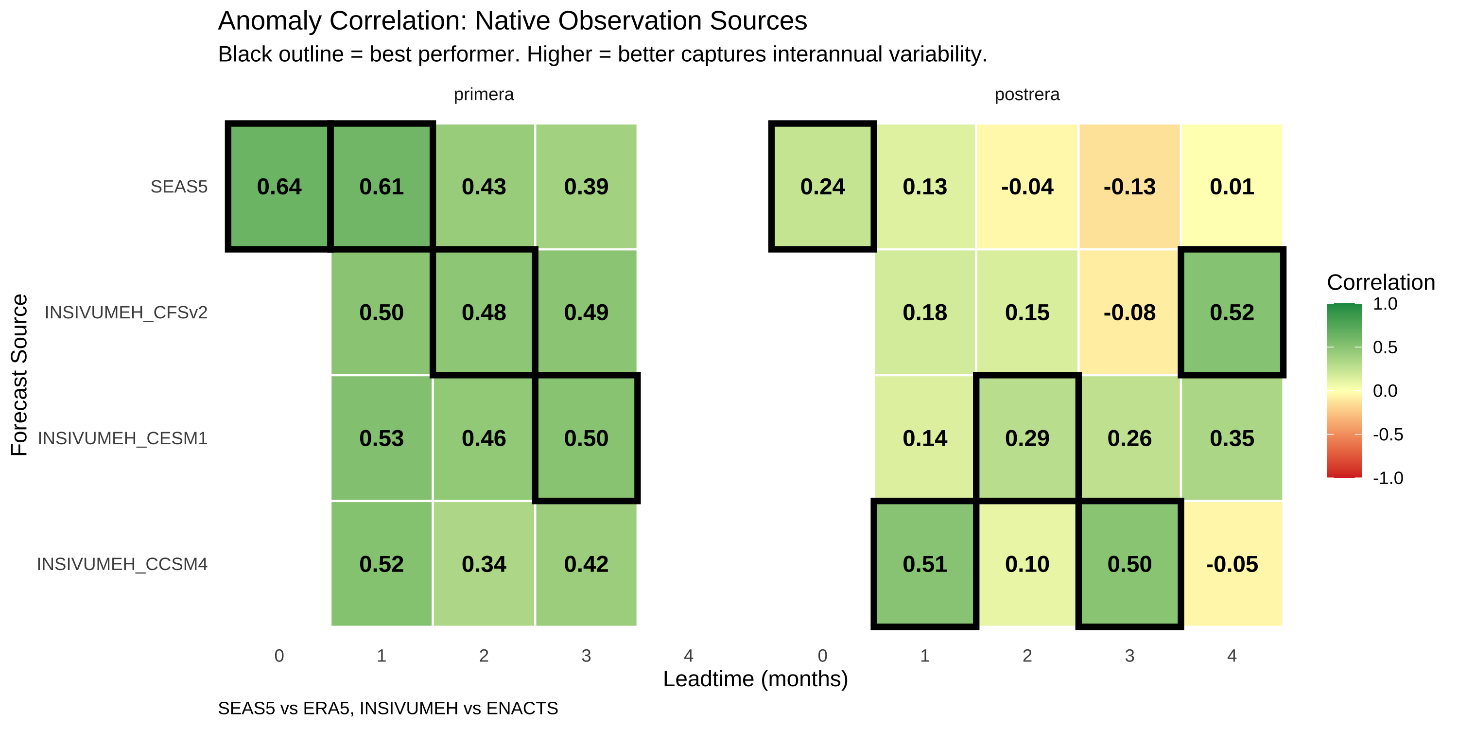
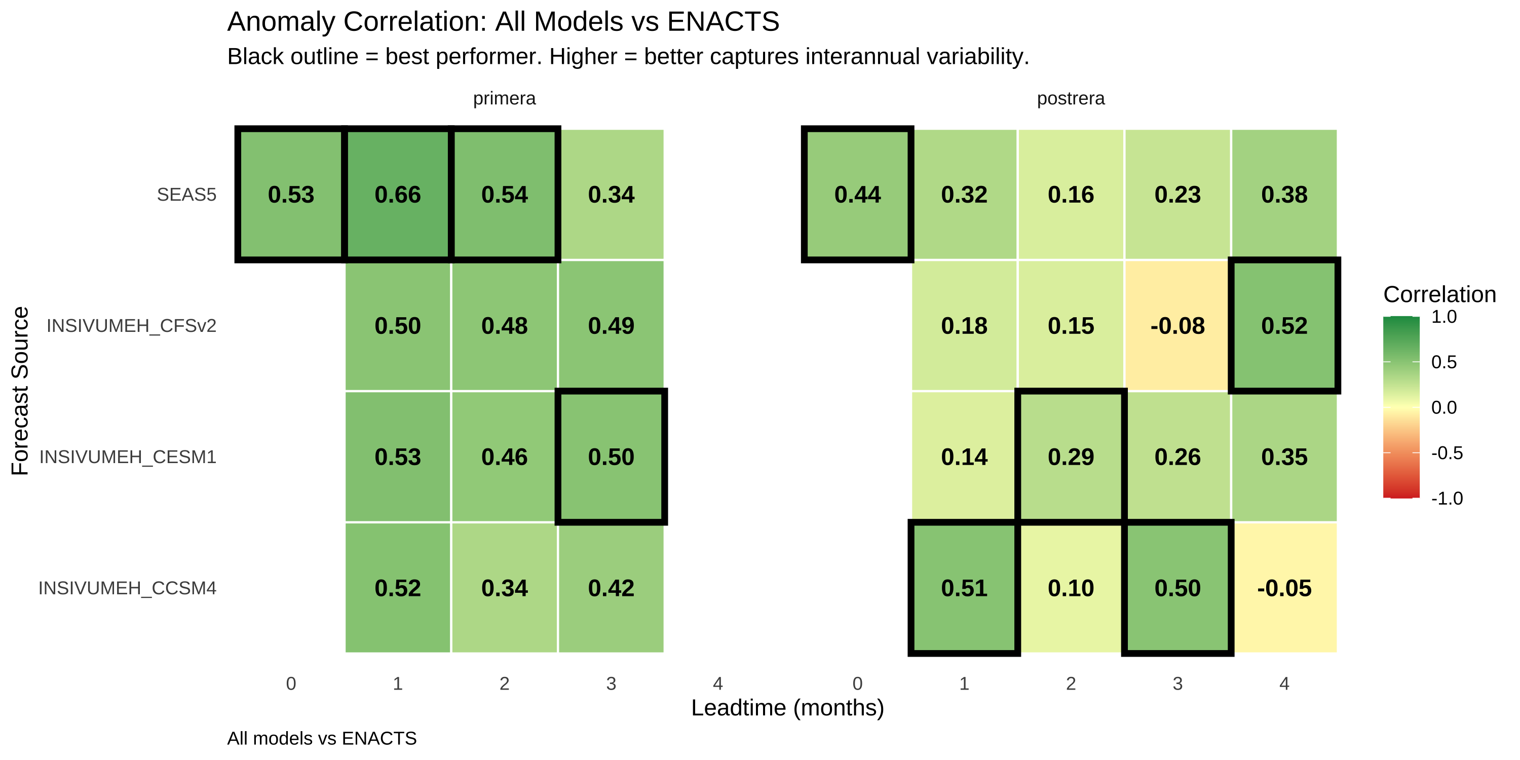
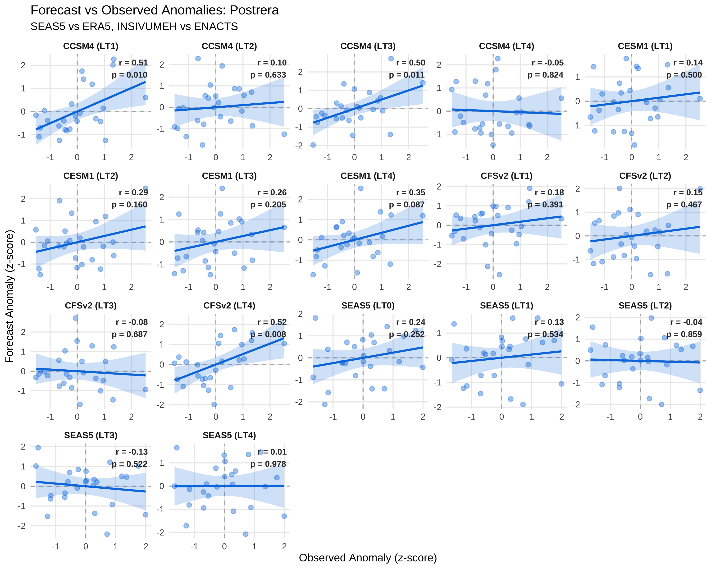
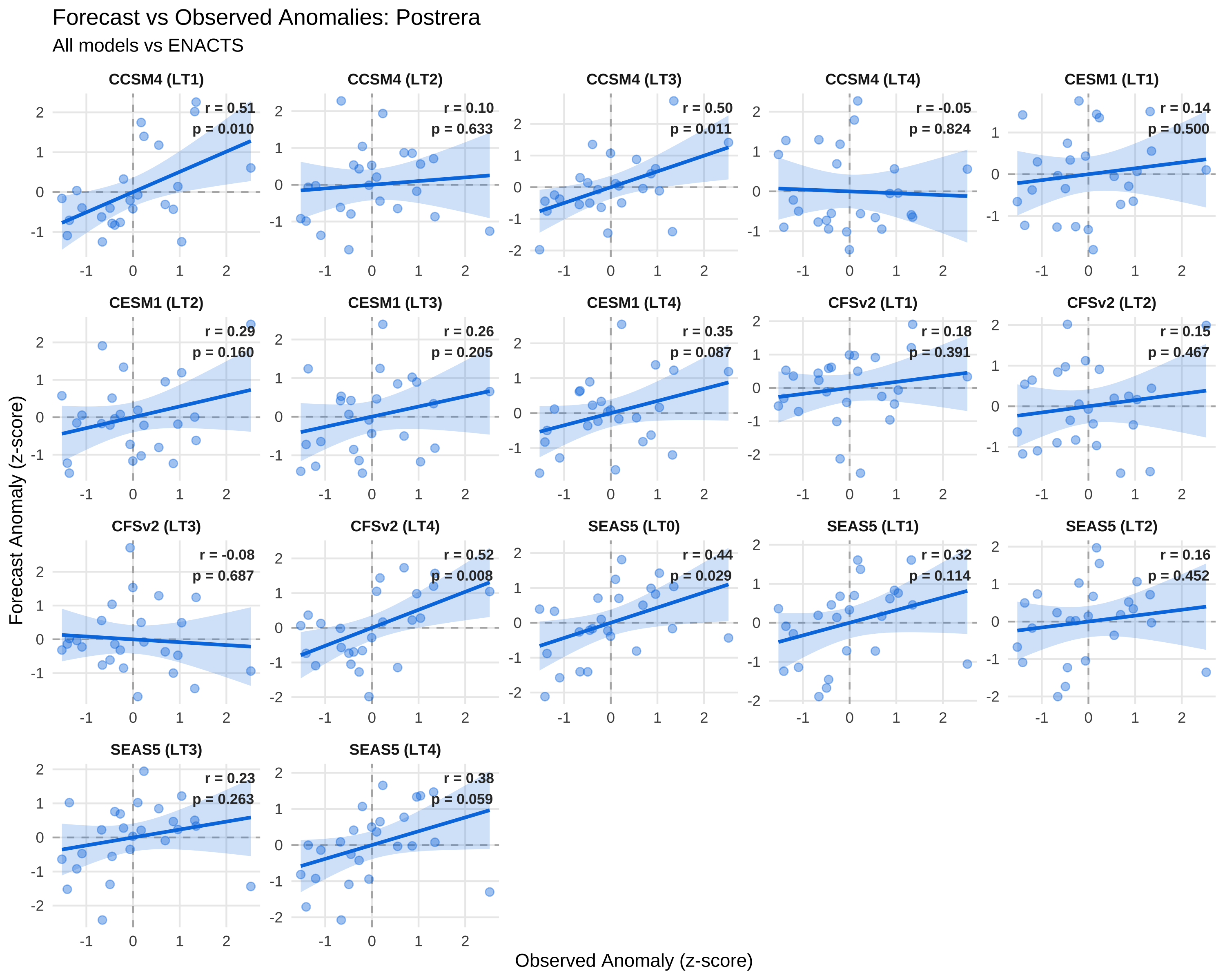
6 Anomaly Correlation

Correlation measures how well forecasts track interannual variability - do wet years get predicted as wet and dry years as dry? Unlike F1, correlation is sensitive to the magnitude of anomalies, not just threshold exceedance.

Calculate standardized anomalies and correlations
# Forecast anomalies
df_fcst_anom <- df_fcst_all |>
  group_by(forecast_source, window, leadtime) |>
  mutate(
    fcst_mean = mean(value, na.rm = TRUE),
    fcst_sd = sd(value, na.rm = TRUE),
    fcst_anom = (value - fcst_mean) / fcst_sd
  ) |>
  ungroup() |>
  select(year, window, leadtime, forecast_source, value, fcst_anom)

# Observation anomalies
calc_obs_anom <- function(df, obs_name) {
  df |>
    filter(year >= BASELINE_START, year <= BASELINE_END) |>
    group_by(window) |>
    mutate(
      obs_mean = mean(obs_mm, na.rm = TRUE),
      obs_sd = sd(obs_mm, na.rm = TRUE),
      obs_anom = (obs_mm - obs_mean) / obs_sd
    ) |>
    ungroup() |>
    mutate(obs_source = obs_name) |>
    select(year, window, obs_mm, obs_anom, obs_source)
}

df_enacts_anom <- calc_obs_anom(df_enacts, "ENACTS")
df_era5_anom <- calc_obs_anom(df_era5, "ERA5")

# Join forecast and observed anomalies (keep raw data for scatterplots)
df_anom_native <- bind_rows(
  df_fcst_anom |>
    filter(forecast_source == "SEAS5") |>
    inner_join(df_era5_anom, by = c("year", "window")),
  df_fcst_anom |>
    filter(str_detect(forecast_source, "INSIVUMEH")) |>
    inner_join(df_enacts_anom, by = c("year", "window"))
)

df_anom_enacts <- df_fcst_anom |>
  inner_join(df_enacts_anom, by = c("year", "window"))

# Summarize correlations
calc_corr_summary <- function(df) {
  df |>
    group_by(forecast_source, window, leadtime, obs_source) |>
    summarise(
      n = n(),
      corr = cor(fcst_anom, obs_anom, use = "complete.obs"),
      .groups = "drop"
    )
}

df_corr_native <- calc_corr_summary(df_anom_native)
df_corr_enacts <- calc_corr_summary(df_anom_enacts)
Correlation heatmap function
create_corr_heatmap <- function(df_corr, title, subtitle, caption) {
  df_plot <- df_corr |>
    filter(!is.na(corr)) |>
    mutate(window = factor(window, levels = c("primera", "postrera"))) |>
    group_by(window, leadtime) |>
    mutate(is_best = corr == max(corr, na.rm = TRUE)) |>
    ungroup()

  ggplot(df_plot, aes(x = factor(leadtime), y = forecast_source)) +
    geom_tile(aes(fill = corr), color = "white", linewidth = 0.5) +
    geom_tile(
      data = df_plot |> filter(is_best),
      aes(x = factor(leadtime), y = forecast_source),
      fill = NA, color = "black", linewidth = 1.5
    ) +
    geom_text(aes(label = sprintf("%.2f", corr)), size = 4, fontface = "bold", color = "black") +
    facet_wrap(~window) +
    scale_fill_gradient2(
      low = "#D73027", mid = "#FFFFBF", high = "#1A9850",
      midpoint = 0, limits = c(-1, 1),
      name = "Correlation"
    ) +
    labs(
      title = title,
      subtitle = subtitle,
      x = "Leadtime (months)",
      y = "Forecast Source",
      caption = caption
    ) +
    theme_minimal() +
    theme(
      legend.position = "right",
      panel.grid = element_blank(),
      plot.caption = element_text(hjust = 0)
    )
}

6.1 Native Comparison

Code
create_corr_heatmap(
  df_corr_native,
  title = "Anomaly Correlation: Native Observation Sources",
  subtitle = "Black outline = best performer. Higher = better captures interannual variability.",
  caption = "SEAS5 vs ERA5, INSIVUMEH vs ENACTS"
)

6.2 ENACTS-Only Comparison

Code
create_corr_heatmap(
  df_corr_enacts,
  title = "Anomaly Correlation: All Models vs ENACTS",
  subtitle = "Black outline = best performer. Higher = better captures interannual variability.",
  caption = "All models vs ENACTS"
)

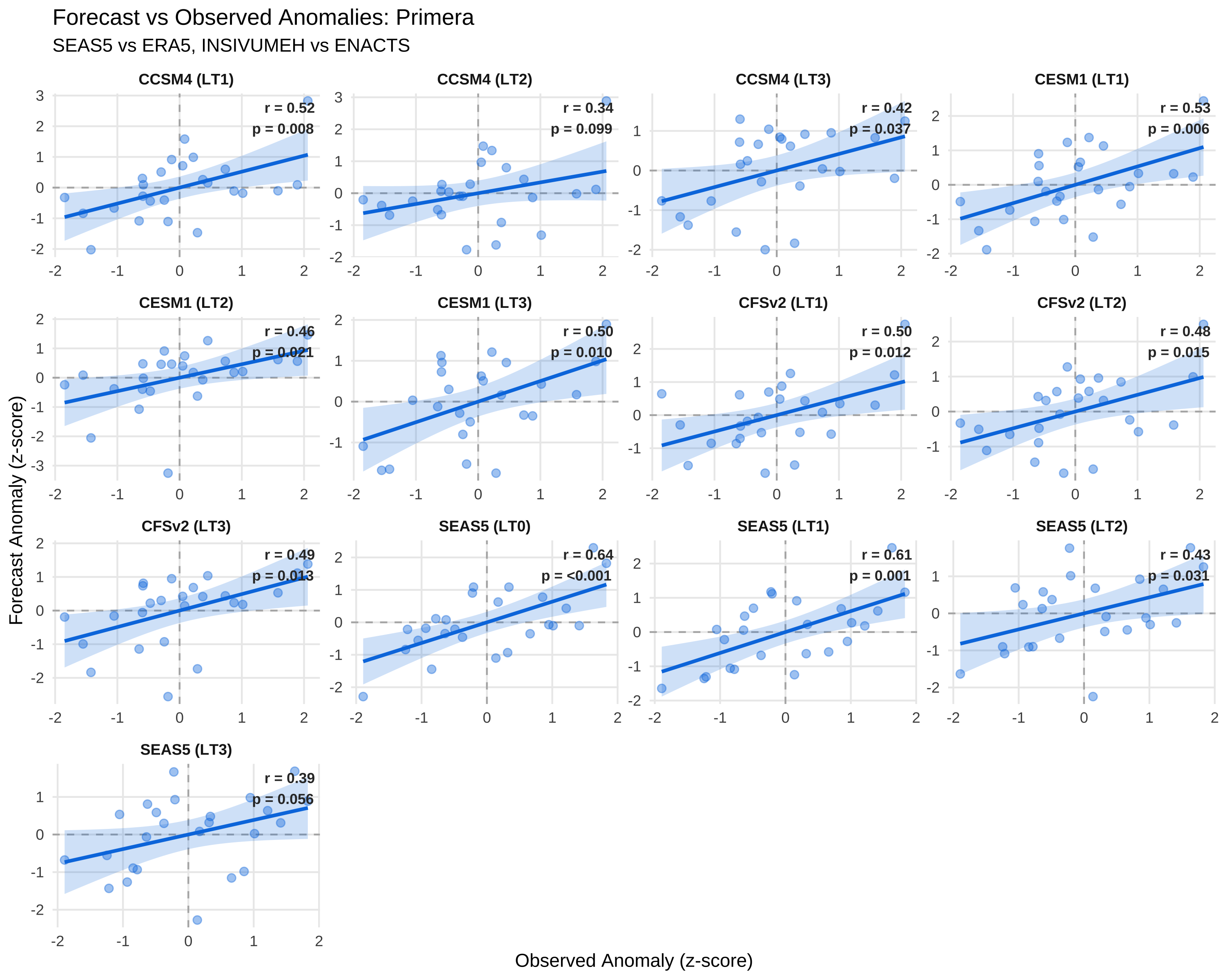
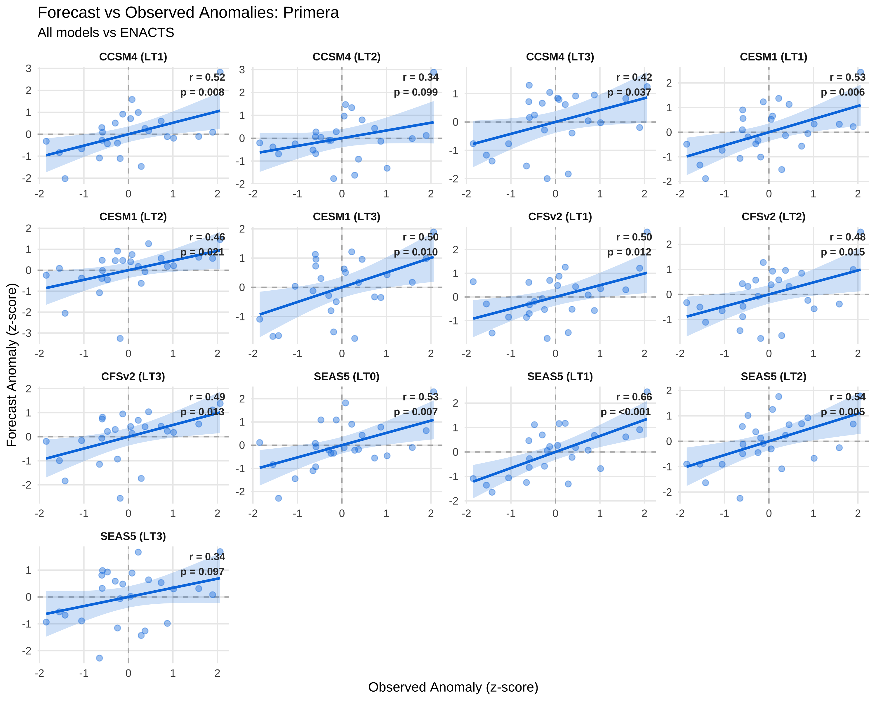
6.3 Scatterplots

Scatterplots show the relationship between forecast and observed anomalies for each model-leadtime combination.

Scatterplot function with R² and p-value
create_corr_scatter <- function(df_anom, window_name, title_suffix) {
  df_plot <- df_anom |>
    filter(window == window_name) |>
    mutate(
      model_short = str_remove(forecast_source, "INSIVUMEH_"),
      facet_label = paste0(model_short, " (LT", leadtime, ")")
    )

  # Calculate r and p-value for each facet
  df_stats <- df_plot |>
    group_by(forecast_source, leadtime, facet_label) |>
    summarise(
      r = cor(fcst_anom, obs_anom, use = "complete.obs"),
      p_value = cor.test(fcst_anom, obs_anom)$p.value,
      .groups = "drop"
    ) |>
    mutate(
      label = paste0("r = ", sprintf("%.2f", r), "\n",
                     "p = ", ifelse(p_value < 0.001, "<0.001", sprintf("%.3f", p_value)))
    )

  ggplot(df_plot, aes(x = obs_anom, y = fcst_anom)) +
    geom_hline(yintercept = 0, color = "grey70", linetype = "dashed") +
    geom_vline(xintercept = 0, color = "grey70", linetype = "dashed") +
    geom_smooth(method = "lm", se = TRUE, color = "#007CE1", fill = "#007CE1", alpha = 0.2) +
    geom_point(alpha = 0.4, size = 2) +
    geom_text(
      data = df_stats,
      aes(x = Inf, y = Inf, label = label),
      hjust = 1.1, vjust = 1.3, size = 3, color = "grey20", fontface = "bold",
      inherit.aes = FALSE
    ) +
    facet_wrap(~facet_label, scales = "free") +
    labs(
      title = paste0("Forecast vs Observed Anomalies: ", str_to_title(window_name)),
      subtitle = title_suffix,
      x = "Observed Anomaly (z-score)",
      y = "Forecast Anomaly (z-score)"
    ) +
    theme_minimal() +
    theme(
      strip.text = element_text(face = "bold", size = 9),
      panel.grid.minor = element_blank()
    )
}

6.3.1 Primera Season

Code
create_corr_scatter(df_anom_native, "primera", "SEAS5 vs ERA5, INSIVUMEH vs ENACTS")

Code
create_corr_scatter(df_anom_enacts, "primera", "All models vs ENACTS")

6.3.2 Postrera Season

Code
create_corr_scatter(df_anom_native, "postrera", "SEAS5 vs ERA5, INSIVUMEH vs ENACTS")

Code
create_corr_scatter(df_anom_enacts, "postrera", "All models vs ENACTS")

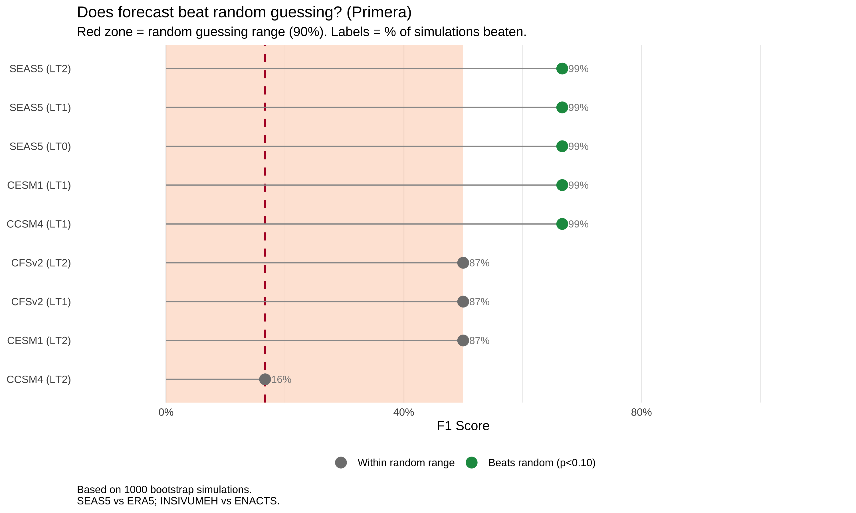
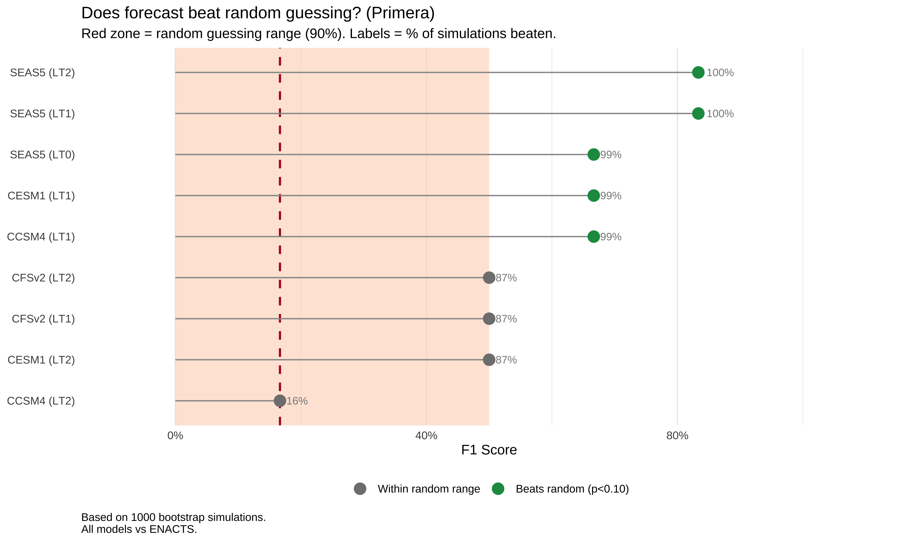
7 Comparison to Random Guessing

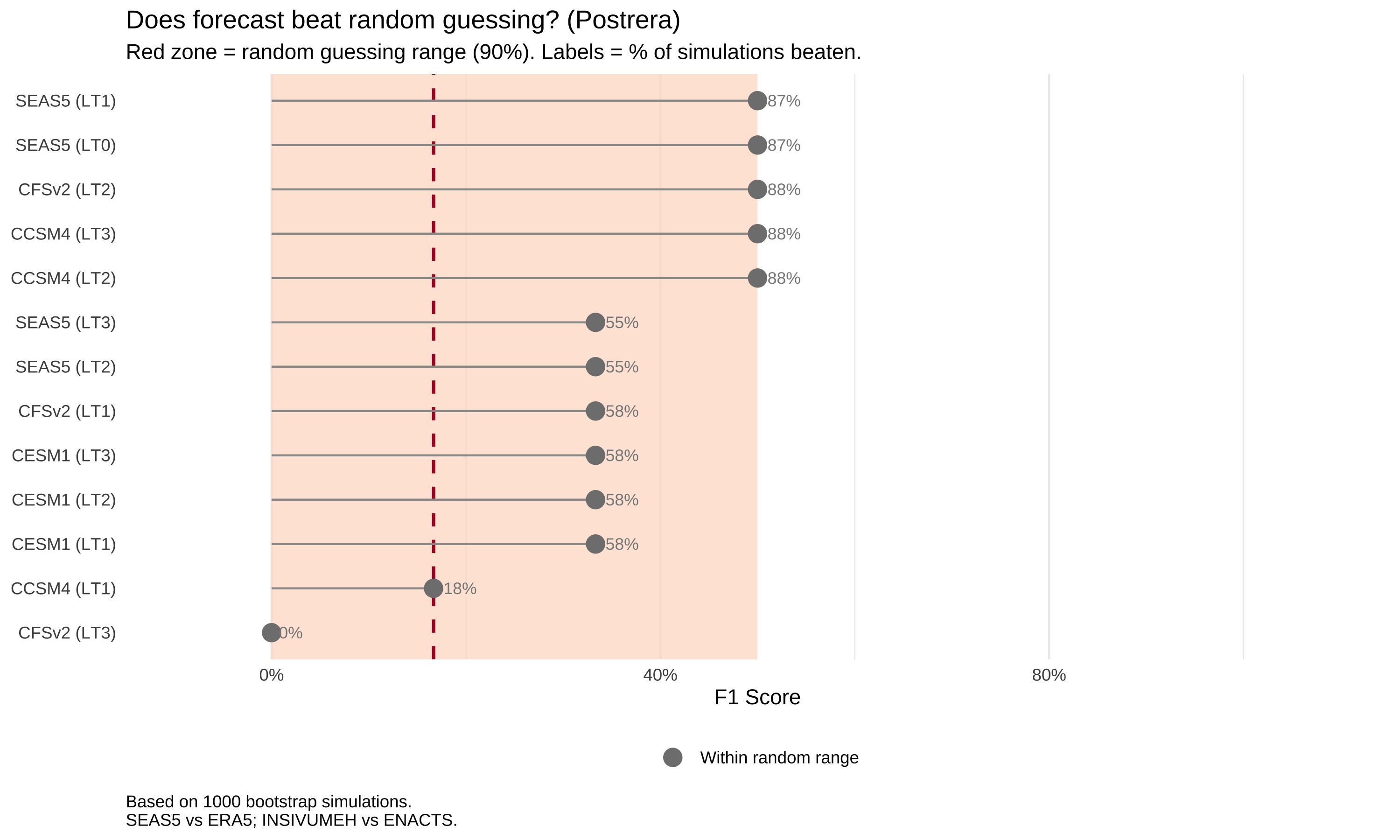
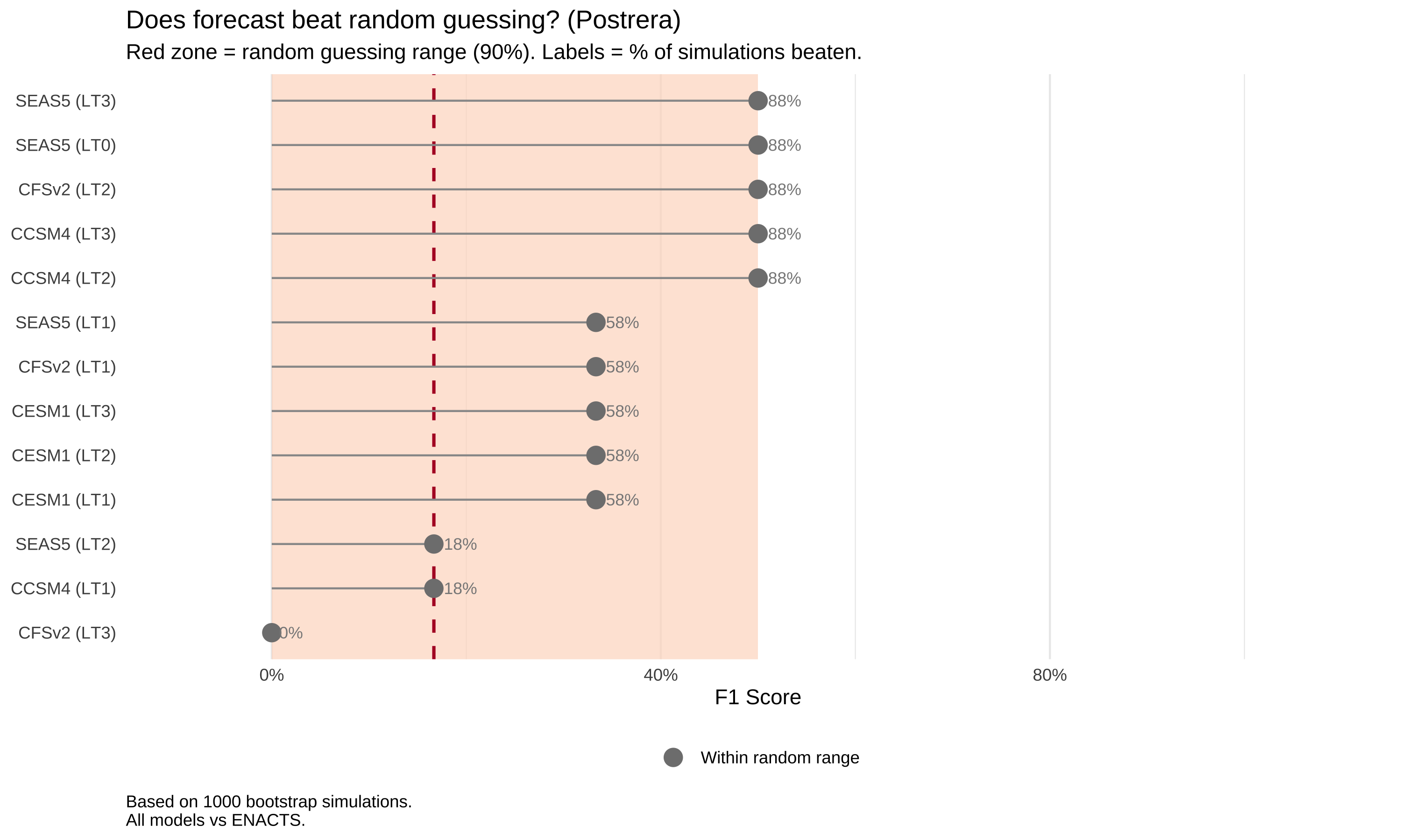
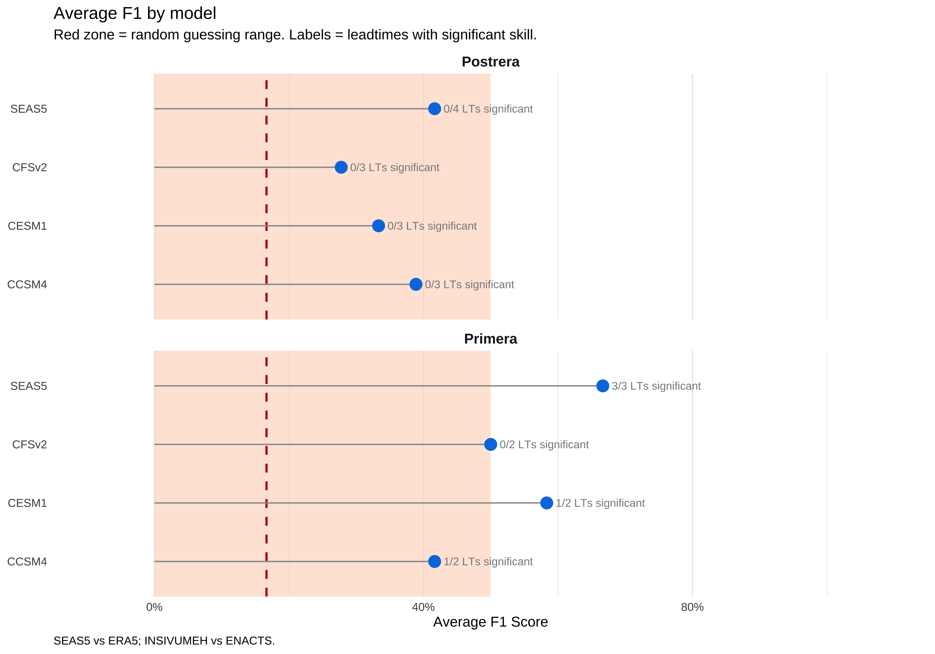
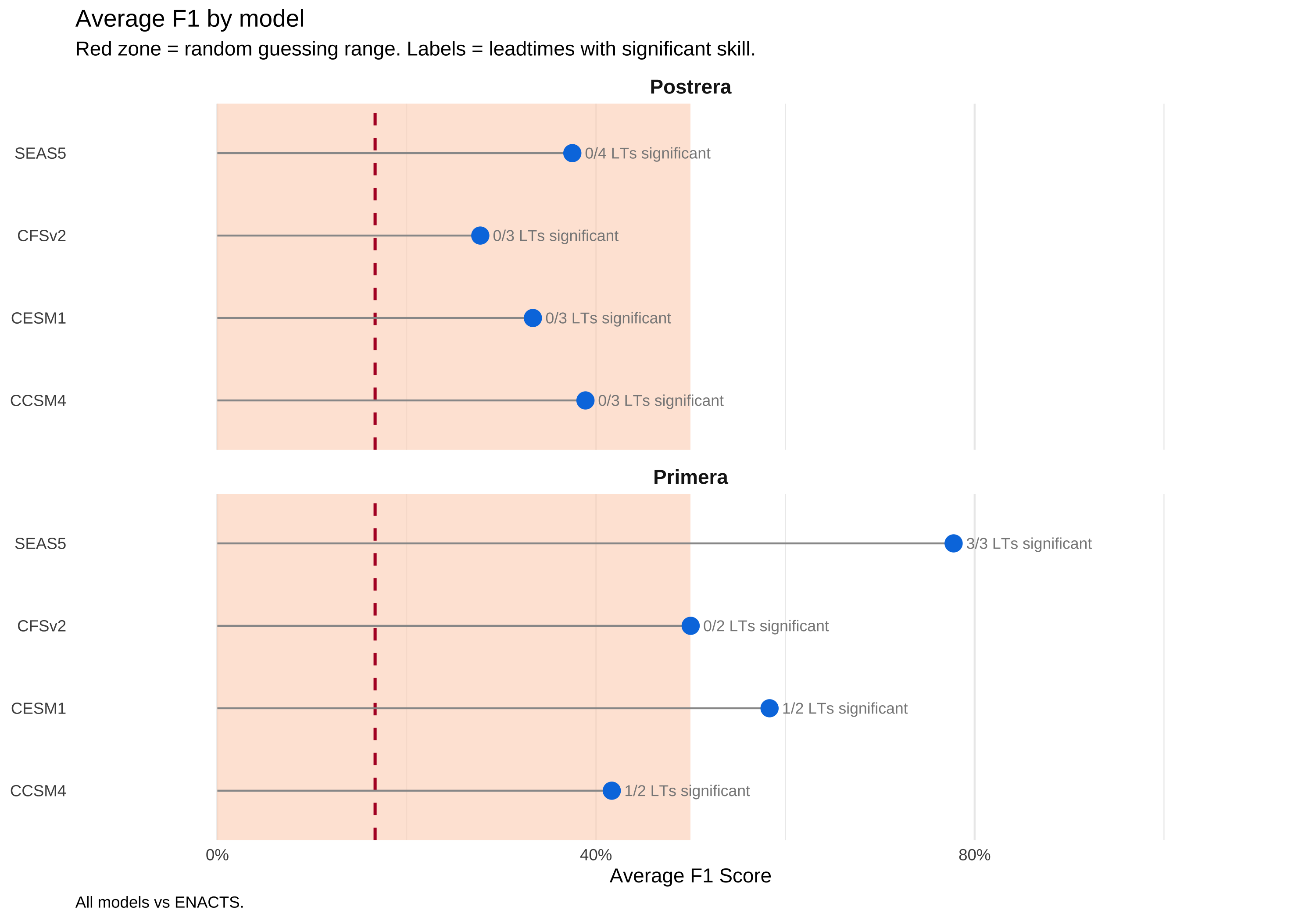
A forecast is only useful if it outperforms random guessing. We use bootstrap simulation to establish what F1 score we’d expect from randomly guessing 6 drought years out of 25.

Identify drought years and run bootstrap
# Get observed drought years
get_drought_years <- function(df_obs, window_name) {
  df_obs |>
    filter(window == window_name, year >= BASELINE_START, year <= BASELINE_END) |>
    arrange(obs_mm) |>
    mutate(rank = row_number(), rp = (n() + 1) / rank) |>
    filter(rp >= 4) |>
    pull(year) |>
    sort()
}

drought_years <- list(
  primera_enacts = get_drought_years(df_enacts, "primera"),
  postrera_enacts = get_drought_years(df_enacts, "postrera"),
  primera_era5 = get_drought_years(df_era5, "primera"),
  postrera_era5 = get_drought_years(df_era5, "postrera")
)

# Bootstrap random F1
all_years <- BASELINE_START:BASELINE_END

bootstrap_f1 <- function(obs_drought_years, all_years, n_sim = N_BOOTSTRAP) {
  n_drought <- length(obs_drought_years)

  map_dbl(1:n_sim, \(i) {
    random_drought <- sample(all_years, n_drought, replace = FALSE)
    fcst_drought <- all_years %in% random_drought
    obs_drought <- all_years %in% obs_drought_years
    calc_f1(fcst_drought, obs_drought)
  })
}

# Run bootstrap for each combination
bootstrap_results <- list()
for (window in c("primera", "postrera")) {
  for (obs_source in c("enacts", "era5")) {
    key <- paste0(window, "_", obs_source)
    bootstrap_results[[key]] <- bootstrap_f1(drought_years[[key]], all_years)
  }
}

# Calculate percentiles
random_percentiles <- map_dfr(names(bootstrap_results), \(key) {
  parts <- str_split(key, "_")[[1]]
  tibble(
    window = parts[1],
    obs_source = toupper(parts[2]),
    p50 = quantile(bootstrap_results[[key]], 0.50),
    p90 = quantile(bootstrap_results[[key]], 0.90),
    p95 = quantile(bootstrap_results[[key]], 0.95)
  )
})
Compare model F1 to random baseline
# Classified data already created in yardstick-run chunk (df_classified_native, df_classified_enacts)

# Calculate model F1 using yardstick column names
calc_model_f1 <- function(df_classified) {
  # Ensure factor levels are explicit (drought = positive class)
  drought_levels <- c("drought", "no_drought")

  df_classified |>
    mutate(
      truth = factor(truth, levels = drought_levels),
      estimate = factor(estimate, levels = drought_levels)
    ) |>
    group_by(forecast_source, window, leadtime) |>
    summarise(
      f1 = f_meas_vec(truth, estimate, event_level = "first"),
      n = n(),
      .groups = "drop"
    )
}

df_model_f1_native <- calc_model_f1(df_classified_native) |>
  mutate(obs_source = if_else(forecast_source == "SEAS5", "ERA5", "ENACTS"))

df_model_f1_enacts <- calc_model_f1(df_classified_enacts) |>
  mutate(obs_source = "ENACTS")

# Compare to random
compare_to_random <- function(df_model_f1) {
  df_model_f1 |>
    left_join(random_percentiles, by = c("window", "obs_source")) |>
    rowwise() |>
    mutate(
      key = paste0(window, "_", tolower(obs_source)),
      pct_beats_random = mean(f1 > bootstrap_results[[key]]) * 100,
      significant = f1 > p90
    ) |>
    ungroup() |>
    select(-key)
}

df_comparison_native <- compare_to_random(df_model_f1_native)
df_comparison_enacts <- compare_to_random(df_model_f1_enacts)
Random baseline plot functions
create_random_detail_plot <- function(df, window_name, random_pct, comparison_type) {
  df_plot <- df |>
    filter(window == window_name, !is.na(f1)) |>
    mutate(
      model_lt = paste0(str_remove(forecast_source, "INSIVUMEH_"), " (LT", leadtime, ")"),
      model_lt = fct_reorder(model_lt, f1)
    )

  if (comparison_type == "native") {
    pct_data <- random_pct |> filter(window == window_name)
    caption_text <- paste0("Based on ", N_BOOTSTRAP, " bootstrap simulations.\n",
                           "SEAS5 vs ERA5; INSIVUMEH vs ENACTS.")
  } else {
    pct_data <- random_pct |> filter(window == window_name, obs_source == "ENACTS")
    caption_text <- paste0("Based on ", N_BOOTSTRAP, " bootstrap simulations.\n",
                           "All models vs ENACTS.")
  }

  p90 <- max(pct_data$p90)
  p50 <- mean(pct_data$p50)

  ggplot(df_plot, aes(x = f1, y = model_lt)) +
    annotate("rect", xmin = 0, xmax = p90, ymin = -Inf, ymax = Inf,
             fill = "#FDDBC7", alpha = 0.7) +
    geom_vline(xintercept = p50, linetype = "dashed", color = "#B2182B", linewidth = 0.8) +
    geom_segment(aes(x = 0, xend = f1, yend = model_lt), color = "grey60") +
    geom_point(aes(color = significant), size = 4) +
    geom_text(aes(label = paste0(round(pct_beats_random), "%")),
              hjust = -0.3, size = 3) +
    scale_x_continuous(limits = c(0, 1), labels = scales::percent, expand = c(0, 0.15)) +
    scale_color_manual(
      values = c("TRUE" = "#1A9850", "FALSE" = "grey50"),
      labels = c("TRUE" = "Beats random (p<0.10)", "FALSE" = "Within random range"),
      name = NULL
    ) +
    labs(
      title = paste0("Does forecast beat random guessing? (", str_to_title(window_name), ")"),
      subtitle = "Red zone = random guessing range (90%). Labels = % of simulations beaten.",
      x = "F1 Score",
      y = NULL,
      caption = caption_text
    ) +
    theme_minimal() +
    theme(
      legend.position = "bottom",
      plot.caption = element_text(hjust = 0),
      panel.grid.major.y = element_blank()
    )
}

create_random_summary_plot <- function(df_comparison, random_pct, comparison_type) {
  df_summary <- df_comparison |>
    group_by(forecast_source, window) |>
    summarise(
      avg_f1 = mean(f1, na.rm = TRUE),
      n_leadtimes = n(),
      n_significant = sum(significant),
      .groups = "drop"
    ) |>
    mutate(
      window = factor(window, levels = c("primera", "postrera")),
      model_short = str_remove(forecast_source, "INSIVUMEH_"),
      label = paste0(n_significant, "/", n_leadtimes, " LTs significant")
    )

  if (comparison_type == "native") {
    p90_max <- max(random_pct$p90)
    p50_avg <- mean(random_pct$p50)
    caption_text <- "SEAS5 vs ERA5; INSIVUMEH vs ENACTS."
  } else {
    pct_enacts <- random_pct |> filter(obs_source == "ENACTS")
    p90_max <- max(pct_enacts$p90)
    p50_avg <- mean(pct_enacts$p50)
    caption_text <- "All models vs ENACTS."
  }

  ggplot(df_summary, aes(x = avg_f1, y = model_short)) +
    annotate("rect", xmin = 0, xmax = p90_max, ymin = -Inf, ymax = Inf,
             fill = "#FDDBC7", alpha = 0.7) +
    geom_vline(xintercept = p50_avg, linetype = "dashed", color = "#B2182B", linewidth = 0.8) +
    geom_segment(aes(x = 0, xend = avg_f1, yend = model_short), color = "grey60") +
    geom_point(size = 4, color = "#007CE1") +
    geom_text(aes(label = label), hjust = -0.1, size = 3) +
    facet_wrap(~str_to_title(window), ncol = 1) +
    scale_x_continuous(limits = c(0, 1), labels = scales::percent, expand = c(0, 0.15)) +
    labs(
      title = "Average F1 by model",
      subtitle = "Red zone = random guessing range. Labels = leadtimes with significant skill.",
      x = "Average F1 Score",
      y = NULL,
      caption = caption_text
    ) +
    theme_minimal() +
    theme(
      legend.position = "none",
      plot.caption = element_text(hjust = 0),
      panel.grid.major.y = element_blank(),
      strip.text = element_text(face = "bold", size = 11)
    )
}
7.1 Primera Season

Code
create_random_detail_plot(df_comparison_native, "primera", random_percentiles, "native")

Code
create_random_detail_plot(df_comparison_enacts, "primera", random_percentiles, "enacts_only")

7.2 Postrera Season

Code
create_random_detail_plot(df_comparison_native, "postrera", random_percentiles, "native")

Code
create_random_detail_plot(df_comparison_enacts, "postrera", random_percentiles, "enacts_only")

7.3 Summary by Model

Code
create_random_summary_plot(df_comparison_native, random_percentiles, "native")

Code
create_random_summary_plot(df_comparison_enacts, random_percentiles, "enacts_only")

8 Operational Recommendations/Constraints

  • Primera: SEAS5 is most performant overall. Required for LT0 (May activation moment)
  • Postrera: Cut down to leadtime 1 & 2 and use SEAS5
Analyze operational leadtimes
# Define operational leadtimes
op_primera <- c(0, 1, 2)
op_postrera <- c(1, 2, 3)

# Get comprehensive metrics for operational leadtimes (ENACTS-only for fair comparison)
df_op_primera <- df_skill_enacts |>
  filter(window == "primera", leadtime %in% op_primera) |>
  left_join(
    df_corr_enacts |> select(forecast_source, window, leadtime, corr),
    by = c("forecast_source", "window", "leadtime")
  ) |>
  left_join(
    df_comparison_enacts |> select(forecast_source, window, leadtime, pct_beats_random, significant),
    by = c("forecast_source", "window", "leadtime")
  )

df_op_postrera <- df_skill_enacts |>
  filter(window == "postrera", leadtime %in% op_postrera) |>
  left_join(
    df_corr_enacts |> select(forecast_source, window, leadtime, corr),
    by = c("forecast_source", "window", "leadtime")
  ) |>
 left_join(
    df_comparison_enacts |> select(forecast_source, window, leadtime, pct_beats_random, significant),
    by = c("forecast_source", "window", "leadtime")
  )
Warning

No model shows statistically significant skill for Postrera. Consider supplementing with monitoring-based triggers (VHI, observed rainfall).

8.0.1 Aggregate Across Leadtimes

What if we trigger when any operational leadtime predicts drought? This tests a “rolling trigger” where you activate if any of your forecast windows flags a drought.

Aggregate forecasts across leadtimes per season
# For each model and year, check if ANY leadtime predicted drought
df_any_lt_trigger <- df_classified_enacts |>
  filter(
    (window == "primera" & leadtime %in% c(1, 2)) |
    (window == "postrera" & leadtime %in% c(1, 2, 3))
  ) |>
  mutate(
    fcst_drought = estimate == "drought",
    obs_drought = truth == "drought"
  ) |>
  group_by(forecast_source, window, year) |>
  summarise(
    any_lt_drought = any(fcst_drought),
    obs_drought = first(obs_drought),  # Same for all LTs in a year
    .groups = "drop"
  )

# Calculate skill for "any LT" trigger
df_any_lt_skill <- df_any_lt_trigger |>
  group_by(forecast_source, window) |>
  summarise(
    n = n(),
    TP = sum(any_lt_drought & obs_drought),
    FP = sum(any_lt_drought & !obs_drought),
    FN = sum(!any_lt_drought & obs_drought),
    TN = sum(!any_lt_drought & !obs_drought),
    .groups = "drop"
  ) |>
  mutate(
    precision = ifelse(TP + FP > 0, TP / (TP + FP), NA),
    recall = ifelse(TP + FN > 0, TP / (TP + FN), NA),
    f1 = ifelse(TP > 0, 2 * precision * recall / (precision + recall), 0),
    model = str_remove(forecast_source, "INSIVUMEH_")
  )
Code
df_any_lt_skill |>
  mutate(
    window = factor(window, levels = c("primera", "postrera")),
    f1_fmt = scales::percent(f1, accuracy = 1),
    precision_fmt = scales::percent(precision, accuracy = 1),
    recall_fmt = scales::percent(recall, accuracy = 1)
  ) |>
  select(model, window, f1_fmt, precision_fmt, recall_fmt, TP, FP, FN, TN) |>
  arrange(window, desc(f1_fmt)) |>
  knitr::kable(
    col.names = c("Model", "Season", "F1", "Precision", "Recall", "TP", "FP", "FN", "TN"),
    caption = "Skill when triggering if ANY operational leadtime predicts drought (Primera: LT1-2, Postrera: LT1-3)"
  )
Skill when triggering if ANY operational leadtime predicts drought (Primera: LT1-2, Postrera: LT1-3)
Model Season F1 Precision Recall TP FP FN TN
SEAS5 primera 83% 83% 83% 5 1 1 18
CESM1 primera 71% 62% 83% 5 3 1 16
CCSM4 primera 53% 44% 67% 4 5 2 14
CFSv2 primera 50% 50% 50% 3 3 3 16
SEAS5 postrera 53% 44% 67% 4 5 2 14
CESM1 postrera 48% 33% 83% 5 10 1 9
CCSM4 postrera 45% 31% 83% 5 11 1 8
CFSv2 postrera 40% 29% 67% 4 10 2 9

8.0.2 Error Magnitude Analysis (Postrera)

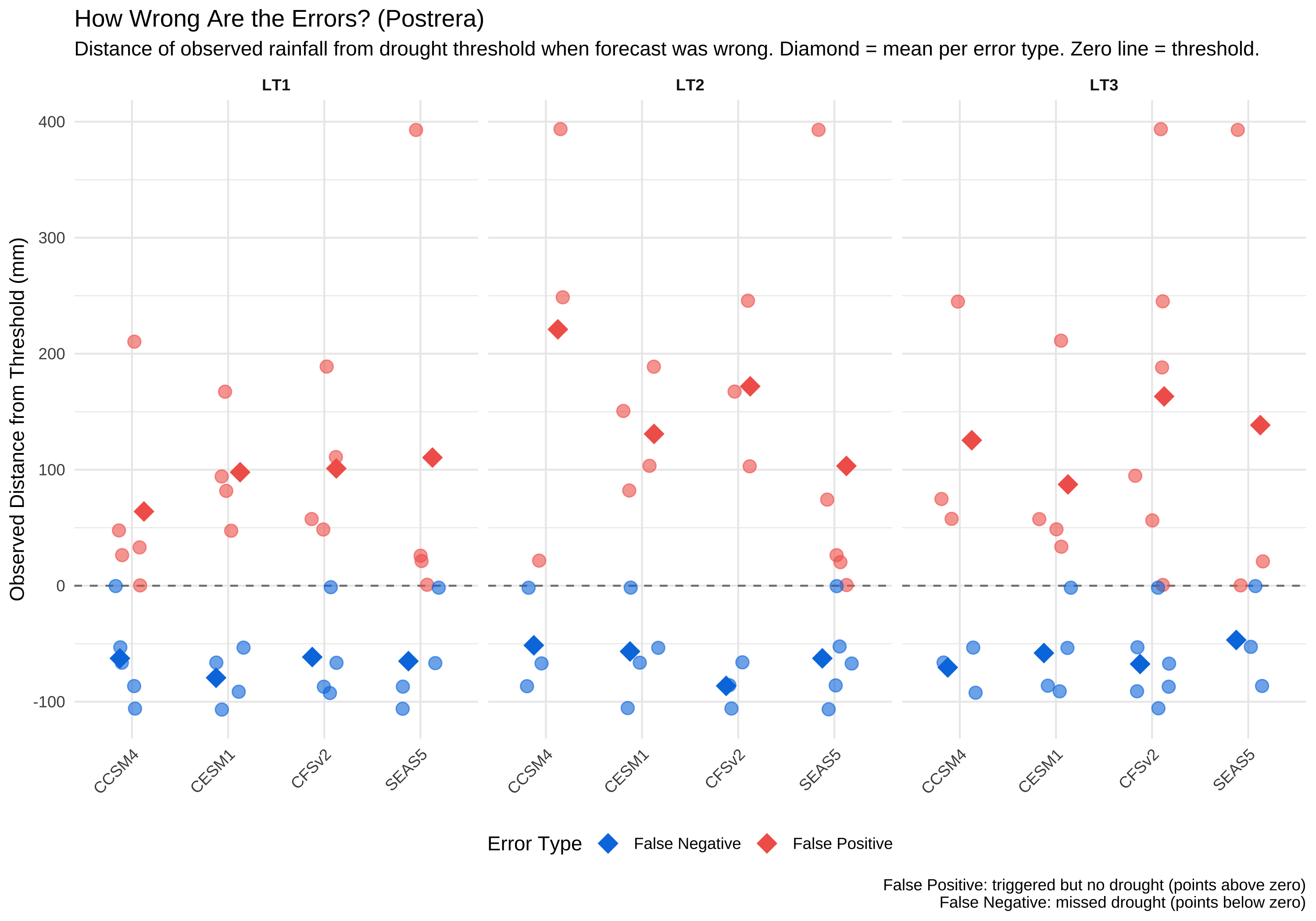
Since Primera shows clear skill with SEAS5, we focus on Postrera where decisions are harder. When the forecast is wrong, how wrong is it? This helps distinguish between near-misses and catastrophic failures.

Calculate distance from threshold for FP and FN cases
# Get threshold values for reference
obs_thresholds_enacts <- df_enacts |>
  filter(year >= BASELINE_START, year <= BASELINE_END) |>
  group_by(window) |>
  summarise(obs_threshold = calc_rp_threshold(obs_mm, 4, -1), .groups = "drop")

# Analyze errors - Postrera only (Primera is decided)
df_error_analysis <- df_classified_enacts |>
  filter(window == "postrera", leadtime %in% c(1, 2, 3)) |>
  left_join(obs_thresholds_enacts, by = "window") |>
  mutate(
    fcst_drought = estimate == "drought",
    obs_drought = truth == "drought",
    error_type = case_when(
      fcst_drought & !obs_drought ~ "False Positive",
      !fcst_drought & obs_drought ~ "False Negative",
      TRUE ~ NA_character_
    ),
    # Distance from threshold (positive = wetter than threshold, negative = drier)
    obs_distance_mm = obs_mm - obs_threshold,
    # As percentage of threshold
    obs_distance_pct = (obs_mm - obs_threshold) / obs_threshold * 100,
    model = str_remove(forecast_source, "INSIVUMEH_")
  ) |>
  filter(!is.na(error_type))

# Summary by error type
df_error_summary <- df_error_analysis |>
  group_by(model, window, leadtime, error_type) |>
  summarise(
    n_errors = n(),
    mean_distance_mm = mean(obs_distance_mm),
    mean_distance_pct = mean(obs_distance_pct),
    .groups = "drop"
  )
Code
df_error_summary |>
  mutate(
    distance_fmt = paste0(round(mean_distance_mm), " mm (", sprintf("%+.0f%%", mean_distance_pct), ")")
  ) |>
  select(model, leadtime, error_type, n_errors, distance_fmt) |>
  arrange(leadtime, error_type, model) |>
  knitr::kable(
    col.names = c("Model", "LT", "Error Type", "N", "Avg Distance from Threshold"),
    caption = "Postrera: How far from threshold was observed rainfall when forecast was wrong? Positive = wetter than threshold, negative = drier."
  )
Postrera: How far from threshold was observed rainfall when forecast was wrong? Positive = wetter than threshold, negative = drier.
Model LT Error Type N Avg Distance from Threshold
CCSM4 1 False Negative 5 -63 mm (-13%)
CESM1 1 False Negative 4 -79 mm (-17%)
CFSv2 1 False Negative 4 -61 mm (-13%)
SEAS5 1 False Negative 4 -65 mm (-14%)
CCSM4 1 False Positive 5 64 mm (+14%)
CESM1 1 False Positive 4 98 mm (+21%)
CFSv2 1 False Positive 4 101 mm (+22%)
SEAS5 1 False Positive 4 110 mm (+24%)
CCSM4 2 False Negative 3 -51 mm (-11%)
CESM1 2 False Negative 4 -57 mm (-12%)
CFSv2 2 False Negative 3 -86 mm (-19%)
SEAS5 2 False Negative 5 -63 mm (-13%)
CCSM4 2 False Positive 3 221 mm (+48%)
CESM1 2 False Positive 4 131 mm (+28%)
CFSv2 2 False Positive 3 172 mm (+37%)
SEAS5 2 False Positive 5 103 mm (+22%)
CCSM4 3 False Negative 3 -70 mm (-15%)
CESM1 3 False Negative 4 -58 mm (-13%)
CFSv2 3 False Negative 6 -67 mm (-15%)
SEAS5 3 False Negative 3 -47 mm (-10%)
CCSM4 3 False Positive 3 125 mm (+27%)
CESM1 3 False Positive 4 87 mm (+19%)
CFSv2 3 False Positive 6 163 mm (+35%)
SEAS5 3 False Positive 3 138 mm (+30%)
Code
# Show individual error cases with separate means for FP and FN (Postrera only)
ggplot(df_error_analysis, aes(x = model, y = obs_distance_mm, color = error_type)) +
  geom_hline(yintercept = 0, linetype = "dashed", color = "grey50") +
  geom_jitter(width = 0.2, alpha = 0.6, size = 3) +
  stat_summary(
    aes(group = error_type),
    fun = mean, geom = "point", shape = 18, size = 5,
    position = position_dodge(width = 0.5)
  ) +
  facet_wrap(~ paste0("LT", leadtime), nrow = 1) +
  scale_color_manual(
    values = c("False Positive" = "#F2645A", "False Negative" = "#007CE1"),
    name = "Error Type"
  ) +
  labs(
    title = "How Wrong Are the Errors? (Postrera)",
    subtitle = "Distance of observed rainfall from drought threshold when forecast was wrong. Diamond = mean per error type. Zero line = threshold.",
    x = NULL,
    y = "Observed Distance from Threshold (mm)",
    caption = "False Positive: triggered but no drought (points above zero)\nFalse Negative: missed drought (points below zero)"
  ) +
  theme_minimal() +
  theme(
    axis.text.x = element_text(angle = 45, hjust = 1),
    legend.position = "bottom",
    strip.text = element_text(face = "bold")
  )

9 Summary