# Time Series & Seasonal Patterns
```{python}
#| echo: false
import sys
from pathlib import Path
repo_root = str(Path.cwd().parent)
if repo_root not in sys.path:
sys.path.insert(0, repo_root)
```
This chapter overlays the GEOGloWS retrospective against GloFAS reanalysis and Google GRRR for the two stations. The aim is to see, before getting to event detection, whether the three sources agree on basin behaviour: typical magnitudes, year-to-year peaks, seasonal cycle.
## Load the data
```{python}
import os
import pandas as pd
import numpy as np
import matplotlib.pyplot as plt
import xarray as xr

from src.constants import STATIONS, RETURN_PERIODS
from src.utils import (
    compute_return_levels,
    load_geoglows_retro,
    load_geoglows_retro_corrected,
)

AA_DATA_DIR = Path(os.environ["AA_DATA_DIR"])
```
```{python}
geoglows = {
    key: load_geoglows_retro(station.geoglows_river_id)
    for key, station in STATIONS.items()
}

glofas_path = (
    AA_DATA_DIR / "public" / "processed" / "npl" / "glofas"
    / "npl_cems-glofas-historical_v4.nc"
)
glofas_df = (
    xr.open_dataset(glofas_path).to_dataframe().reset_index()
    .set_index("time")[["Chatara", "Chisapani"]]
)

from src.datasources.grrr import process_reanalysis
grrr = {}
for key, station in STATIONS.items():
    if station.grrr_gauge_id:
        df = process_reanalysis(gauge=station.grrr_gauge_id)
        grrr[key] = df.set_index("valid_time")[["streamflow"]]
```
| Source | Chatara | Chisapani |
|--------|---------|-----------|
| GEOGloWS | 1940–present | 1940–present |
| GloFAS | 1979–2023 | 1979–2023 |
| GRRR | varies | varies |
## Full retrospective
```{python}
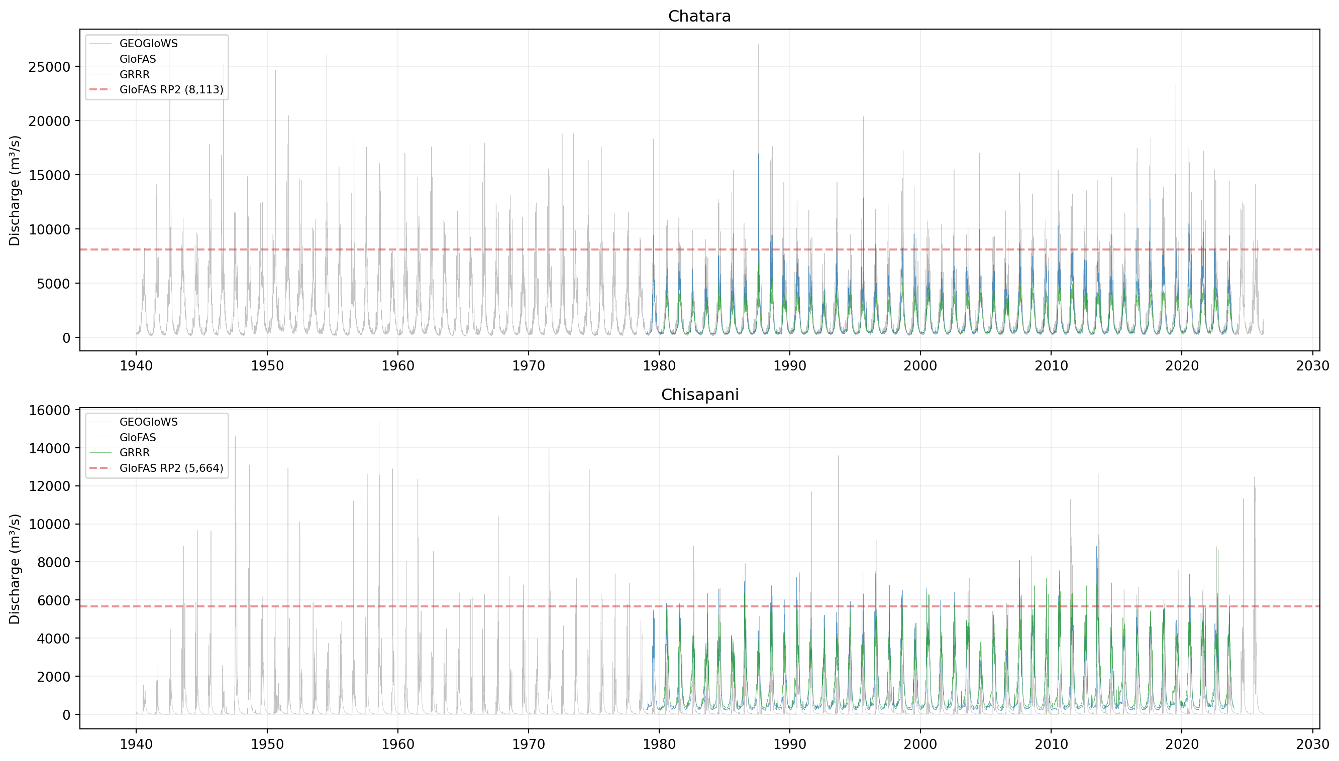
#| fig-cap: "Daily discharge: GEOGloWS retrospective vs GloFAS reanalysis vs GRRR. Dashed line is GloFAS dashboard RP2."
fig, axes = plt.subplots(2, 1, figsize=(14, 8), sharex=False)

for i, (key, station) in enumerate(STATIONS.items()):
    ax = axes[i]
    geo = geoglows[key]
    ax.plot(geo.index, geo["discharge"],
            color="#888888", alpha=0.5, linewidth=0.3, label="GEOGloWS")
    gf = glofas_df[station.dhm_column]
    ax.plot(gf.index, gf.values,
            color="#1f77b4", alpha=0.7, linewidth=0.3, label="GloFAS")
    if key in grrr:
        gr = grrr[key]
        ax.plot(gr.index, gr["streamflow"],
                color="#2ca02c", alpha=0.7, linewidth=0.3, label="GRRR")
    ax.axhline(station.glofas_rp2, color="#d62728", linestyle="--",
               alpha=0.5, label=f"GloFAS RP2 ({station.glofas_rp2:,})")

    ax.set_ylabel("Discharge (m³/s)")
    ax.set_title(station.name)
    ax.legend(loc="upper left", fontsize=8)
    ax.grid(True, alpha=0.2)

plt.tight_layout()
plt.show()
```
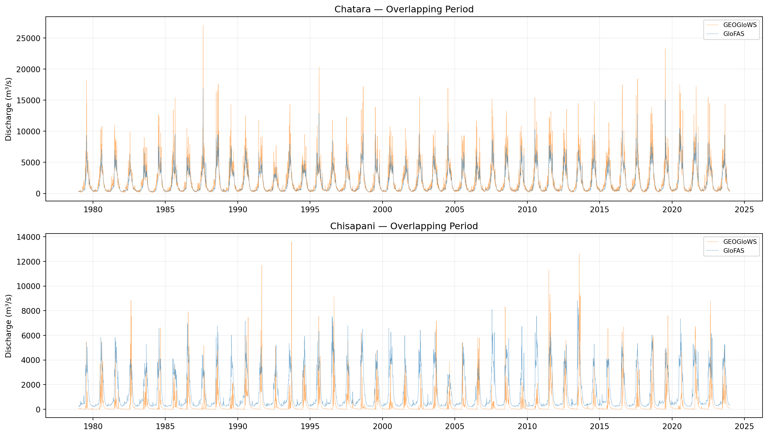
At Chatara the three sources occupy a similar magnitude band, with GEOGloWS reaching the highest peaks (the 1987 peak of ~27,000 m³/s is well above the GloFAS RP2 line and roughly twice the GloFAS-era observed maximum). At Chisapani the picture is different: GEOGloWS sits visibly *below* GloFAS through most of the record, with several pre-1980 peaks in the 13,000–15,000 m³/s range and post-1980 baseline flow much lower than GloFAS's.
## Overlapping period (1979–2023)
```{python}
#| fig-cap: "GEOGloWS vs GloFAS during the overlapping period."
fig, axes = plt.subplots(2, 1, figsize=(14, 8))

for i, (key, station) in enumerate(STATIONS.items()):
    ax = axes[i]
    geo = geoglows[key]
    geo_overlap = geo[
        (geo.index >= glofas_df.index.min())
        & (geo.index <= glofas_df.index.max())
    ]
    ax.plot(geo_overlap.index, geo_overlap["discharge"],
            color="#ff7f0e", alpha=0.6, linewidth=0.4, label="GEOGloWS")
    gf = glofas_df[station.dhm_column]
    ax.plot(gf.index, gf.values,
            color="#1f77b4", alpha=0.6, linewidth=0.4, label="GloFAS")

    ax.set_ylabel("Discharge (m³/s)")
    ax.set_title(f"{station.name} — Overlapping Period")
    ax.legend(fontsize=8)
    ax.grid(True, alpha=0.2)

plt.tight_layout()
plt.show()
```
## Annual maxima
```{python}
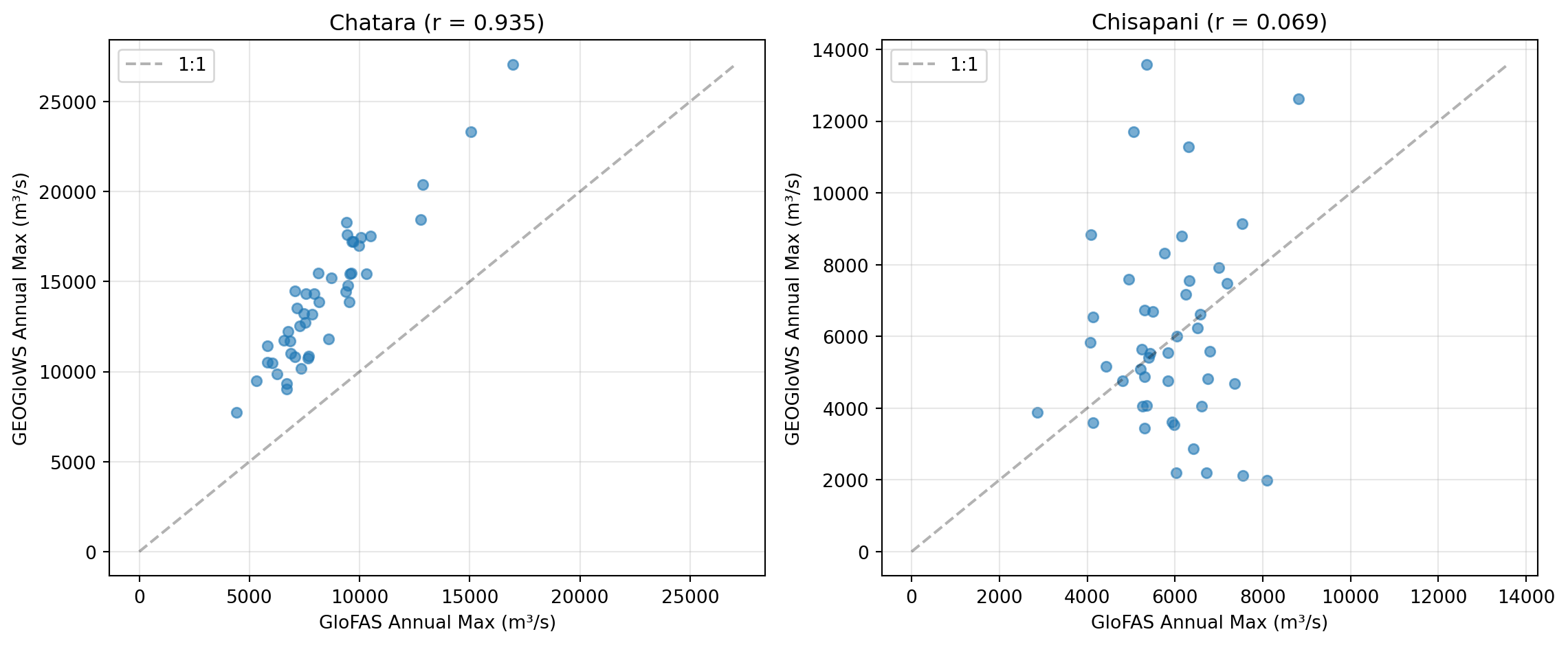
#| fig-cap: "Annual maximum discharge — GEOGloWS vs GloFAS over the overlapping period (1979–2023)."
fig, axes = plt.subplots(1, 2, figsize=(12, 5))
correlations = {}

for ax, (key, station) in zip(axes, STATIONS.items()):
    geo = geoglows[key]
    gf = glofas_df[station.dhm_column]

    geo_annual = geo.groupby(geo.index.year)["discharge"].max()
    gf_annual = gf.groupby(gf.index.year).max()
    common = geo_annual.index.intersection(gf_annual.index)
    geo_c = geo_annual.loc[common]
    gf_c = gf_annual.loc[common]

    ax.scatter(gf_c, geo_c, alpha=0.6, s=30)
    max_val = max(gf_c.max(), geo_c.max())
    ax.plot([0, max_val], [0, max_val], "k--", alpha=0.3, label="1:1")

    r = np.corrcoef(gf_c.values, geo_c.values)[0, 1]
    correlations[key] = r
    ax.set_xlabel("GloFAS Annual Max (m³/s)")
    ax.set_ylabel("GEOGloWS Annual Max (m³/s)")
    ax.set_title(f"{station.name} (r = {r:.3f})")
    ax.legend()
    ax.grid(True, alpha=0.3)

plt.tight_layout()
plt.show()
```
This plot is the most diagnostic in the chapter:
- **Chatara**: r = 0.94. The two models agree on which years had big floods. GEOGloWS sits above the 1:1 line — bigger annual peaks, consistent with its higher published RPs.
- **Chisapani**: r = 0.07. Effectively no relationship. GEOGloWS and GloFAS are not even ranking the same years as the largest. Whatever the correct Karnali peaks are over 1979–2023, only one of these two models can be right about them, and we cannot tell which from this plot alone.
## Seasonal cycle
```{python}
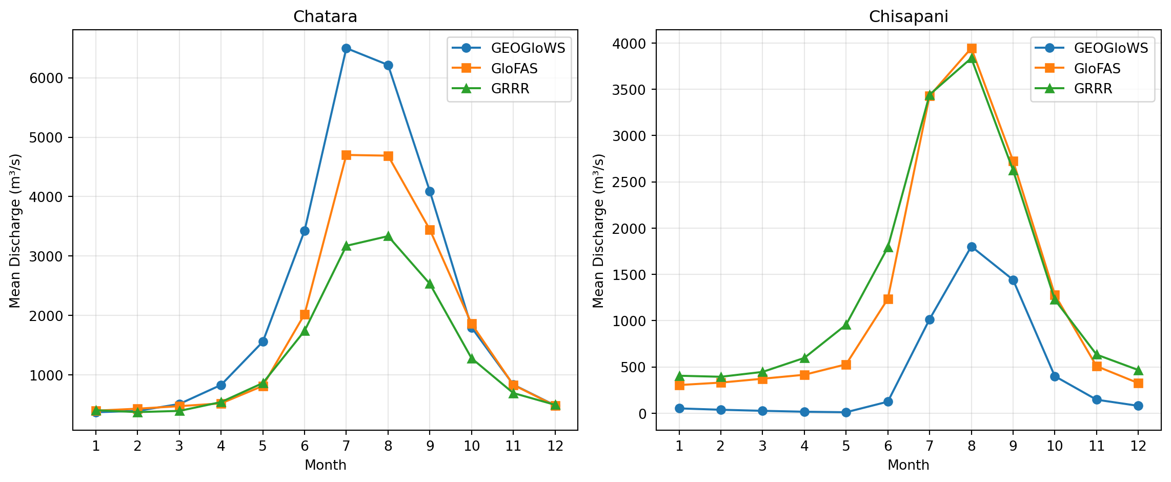
#| fig-cap: "Mean daily discharge by month — seasonal cycle comparison."
fig, axes = plt.subplots(1, 2, figsize=(12, 5))

for ax, (key, station) in zip(axes, STATIONS.items()):
    geo = geoglows[key]
    geo_monthly = geo.groupby(geo.index.month)["discharge"].mean()
    gf = glofas_df[station.dhm_column]
    gf_monthly = gf.groupby(gf.index.month).mean()
    months = range(1, 13)
    ax.plot(months, geo_monthly.values, "o-", label="GEOGloWS")
    ax.plot(months, gf_monthly.values, "s-", label="GloFAS")
    if key in grrr:
        gr = grrr[key]
        gr_monthly = gr.groupby(gr.index.month)["streamflow"].mean()
        ax.plot(months, gr_monthly.values, "^-", label="GRRR")

    ax.set_xlabel("Month")
    ax.set_ylabel("Mean Discharge (m³/s)")
    ax.set_title(station.name)
    ax.legend()
    ax.grid(True, alpha=0.3)
    ax.set_xticks(months)

plt.tight_layout()
plt.show()
```
Phase agrees across all sources — the monsoon peak (July–September) is in the same place — so this is not a calendar-shift problem. The disagreement at Chisapani is in **magnitude**: GEOGloWS's monsoon mean sits well below both GloFAS and GRRR. At Chatara the three sources are within roughly 25% of one another for every month.
## Magnitudes
```{python}
rows = []
for key, station in STATIONS.items():
    geo = geoglows[key]["discharge"]
    gf = glofas_df[station.dhm_column]
    common_start = max(geo.index.min(), gf.index.min())
    common_end = min(geo.index.max(), gf.index.max())
    geo_o = geo[(geo.index >= common_start) & (geo.index <= common_end)]
    gf_o = gf[(gf.index >= common_start) & (gf.index <= common_end)]

    rows.append({
        "Station": station.name, "Source": "GEOGloWS",
        "Period": f"{geo.index.min().year}–{geo.index.max().year}",
        "Mean (m³/s)": f"{geo.mean():,.0f}",
        "Max (m³/s)": f"{geo.max():,.0f}",
        "Overlap mean": f"{geo_o.mean():,.0f}",
    })
    rows.append({
        "Station": station.name, "Source": "GloFAS",
        "Period": f"{gf.index.min().year}–{gf.index.max().year}",
        "Mean (m³/s)": f"{gf.mean():,.0f}",
        "Max (m³/s)": f"{gf.max():,.0f}",
        "Overlap mean": f"{gf_o.mean():,.0f}",
    })

pd.DataFrame(rows)
```
The overlap-mean column is the cleanest comparison. At Chatara, GEOGloWS runs about 26% above GloFAS (2,180 vs 1,730 m³/s). At Chisapani, GEOGloWS runs at **~28% of GloFAS** (356 vs 1,291 m³/s). For a basin where GloFAS's magnitudes are broadly consistent with what we know about the Karnali at Chisapani, this is a large gap and strongly suggests the GEOGloWS RAPID simulation is mass-deficient in this basin — separately from any threshold or distribution choice.
## SFDC bias correction: before vs after
```{python}
#| fig-cap: "Original GEOGloWS retrospective (grey) vs SFDC-corrected (blue)."
fig, axes = plt.subplots(2, 1, figsize=(14, 8))

for ax, (key, station) in zip(axes, STATIONS.items()):
    rid = station.geoglows_river_id
    retro = load_geoglows_retro(rid)
    corrected = load_geoglows_retro_corrected(rid)

    ax.plot(retro.index, retro["discharge"],
            color="#888888", alpha=0.4, linewidth=0.3, label="Original")
    ax.plot(corrected.index, corrected["discharge"],
            color="#1f77b4", alpha=0.6, linewidth=0.3, label="SFDC corrected")
    ax.axhline(station.glofas_rp2, color="#d62728", linestyle="--",
               alpha=0.5, label="GloFAS RP2")

    ax.set_ylabel("Discharge (m³/s)")
    ax.set_title(station.name)
    ax.legend(fontsize=8)
    ax.grid(True, alpha=0.2)

plt.tight_layout()
plt.show()
```
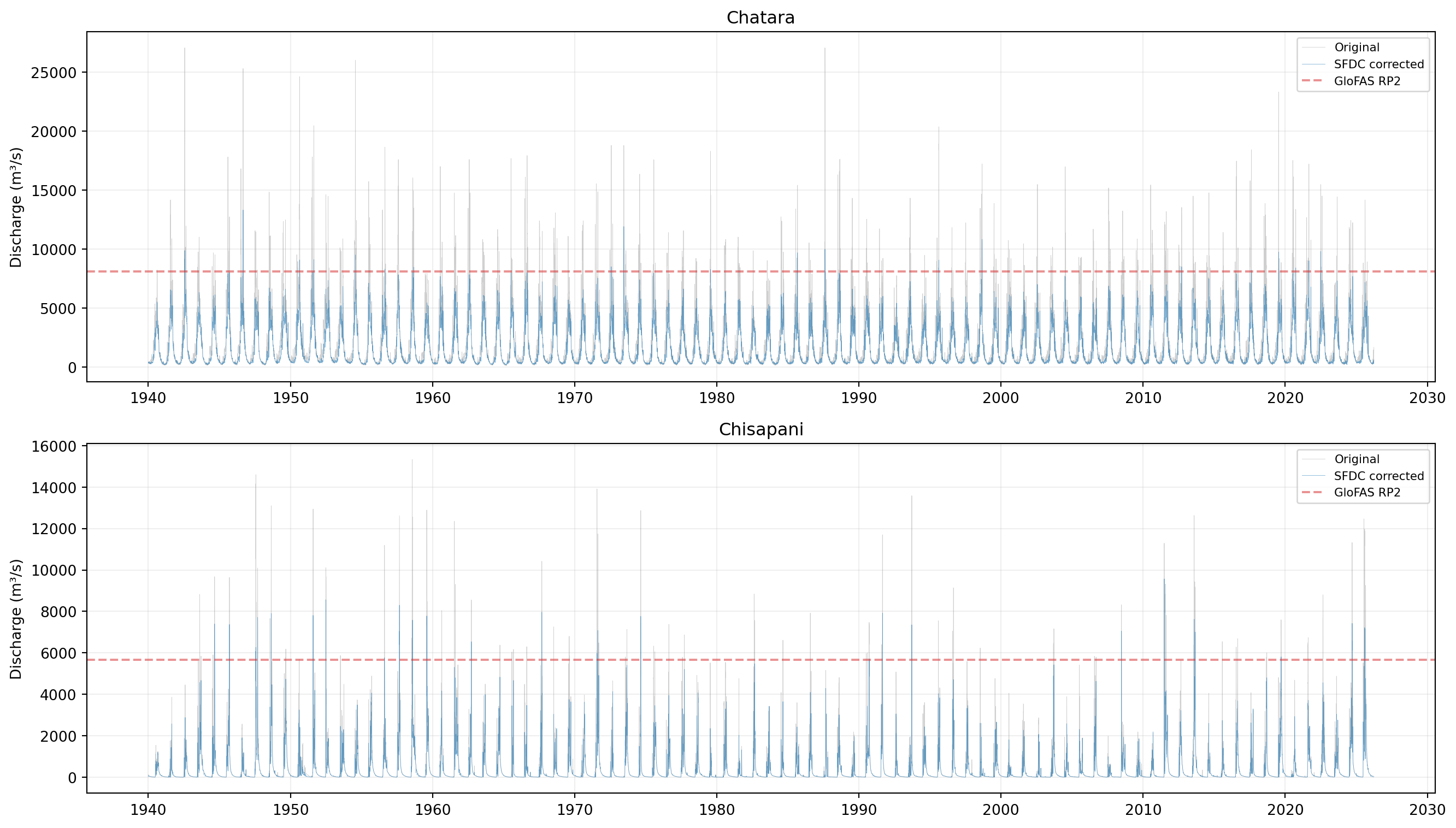
SFDC visibly compresses the upper tail at both stations. At Chatara, the 1987 peak (~27,000 m³/s) drops to ~13,300; the corrected series barely brushes the GloFAS RP2 line where the original cleared it many times. At Chisapani, the correction further deflates an already-low simulation, putting most of the corrected baseline well below the post-1980 GloFAS trace.
The correction is doing what it is designed to do — adjust simulated FDC percentiles using global SABER scalars — but it knows nothing about local observations. With no rating curve to enable `correct_historical()`, we cannot tell whether the deflated SFDC magnitudes are closer to truth or further from it. The event-level test in @sec-event-detection answers that empirically.